HOMELABSABOUTCONTACT
Labs collects my notes on design: short frameworks about how experiences should work, not only how they look, and about the habits behind creative work.
Each one started as a carousel on LinkedIn. Swipe through the slides to read them.
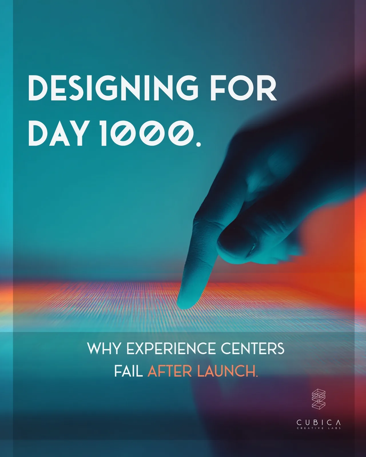
Why Do Experience Centers Fail After Just One Year?
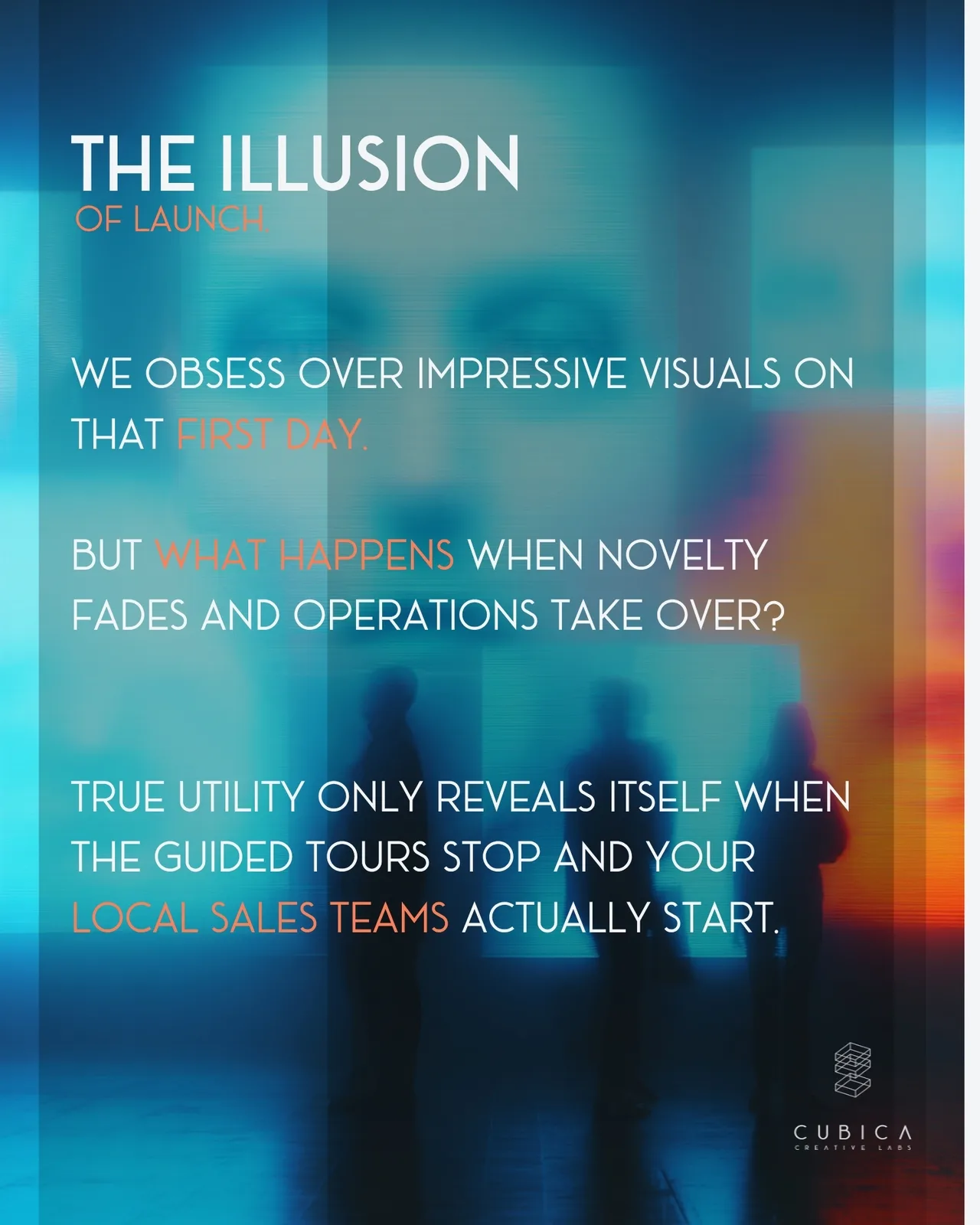
Too many experiential spaces fall victim to the "illusion of launch", planned for opening-day cameras rather than the daily grind ahead.
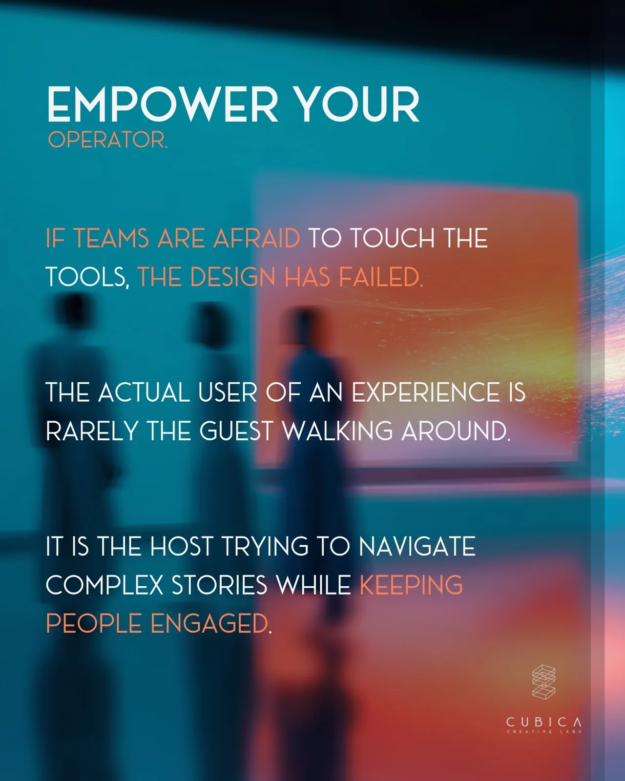
But the actual user of an experience center is rarely just the guest walking around; it is the host trying to navigate complex brand stories while keeping audiences engaged. If an internal team is afraid to touch the interactive tools, the strategy has failed.
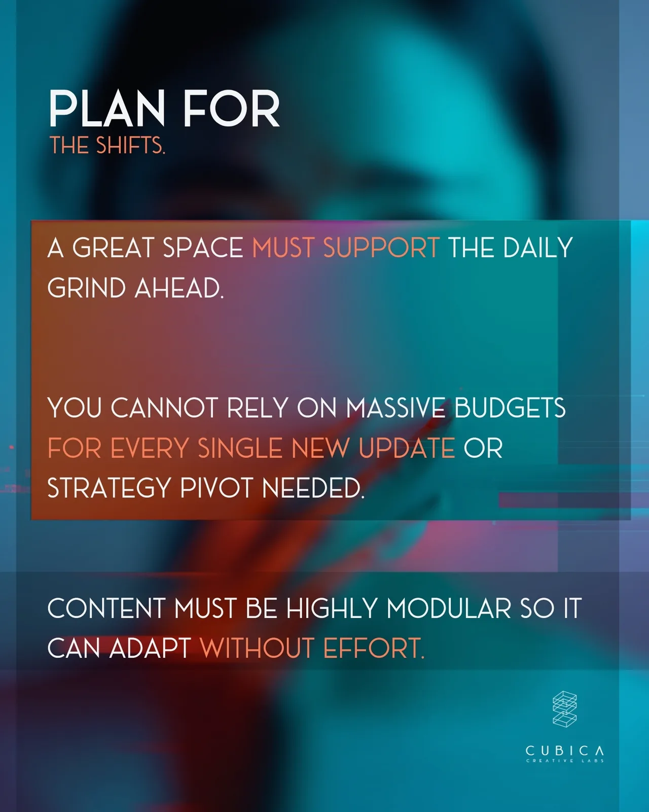
To protect large investments, longevity and adaptability must be understood and prioritized from the initial concept phase.
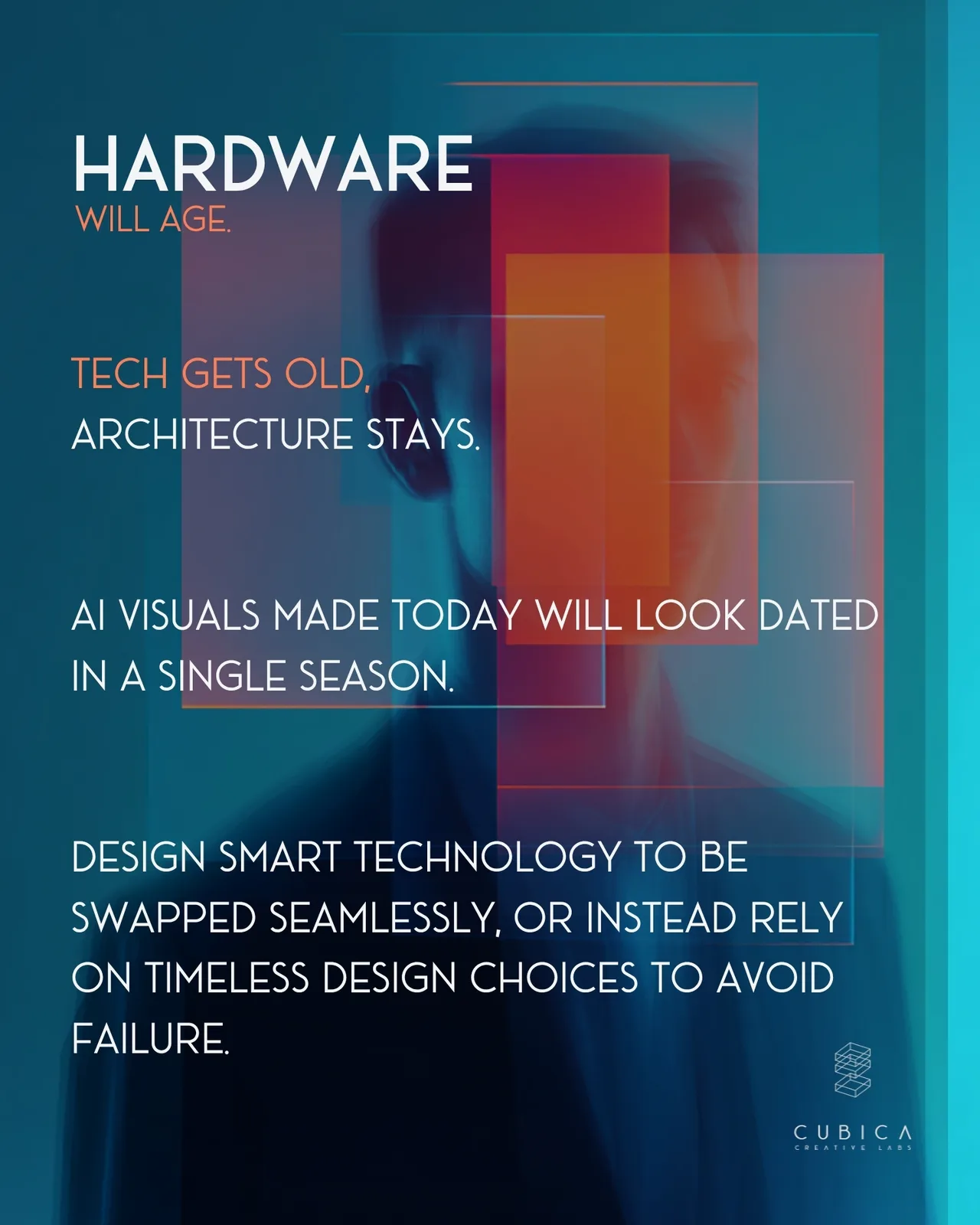
I believe that longevity and adaptability must be understood from the very beginning. Technology will always get old, but architecture stays. To protect large-scale investments, leaders have to stop thinking about short-term novelty and start focusing on spatial resilience, modular content, and operational ease.
This is my framework for rethinking how physical environments should behave long after the launch hype fades.
👉 Swipe through the slides below to see why traditional spaces fail after launch—and the mindset required to plan for Day 1000.
For thousands of years, architecture has been a monologue.
The architect speaks, and the occupants simply have to live inside that speech.
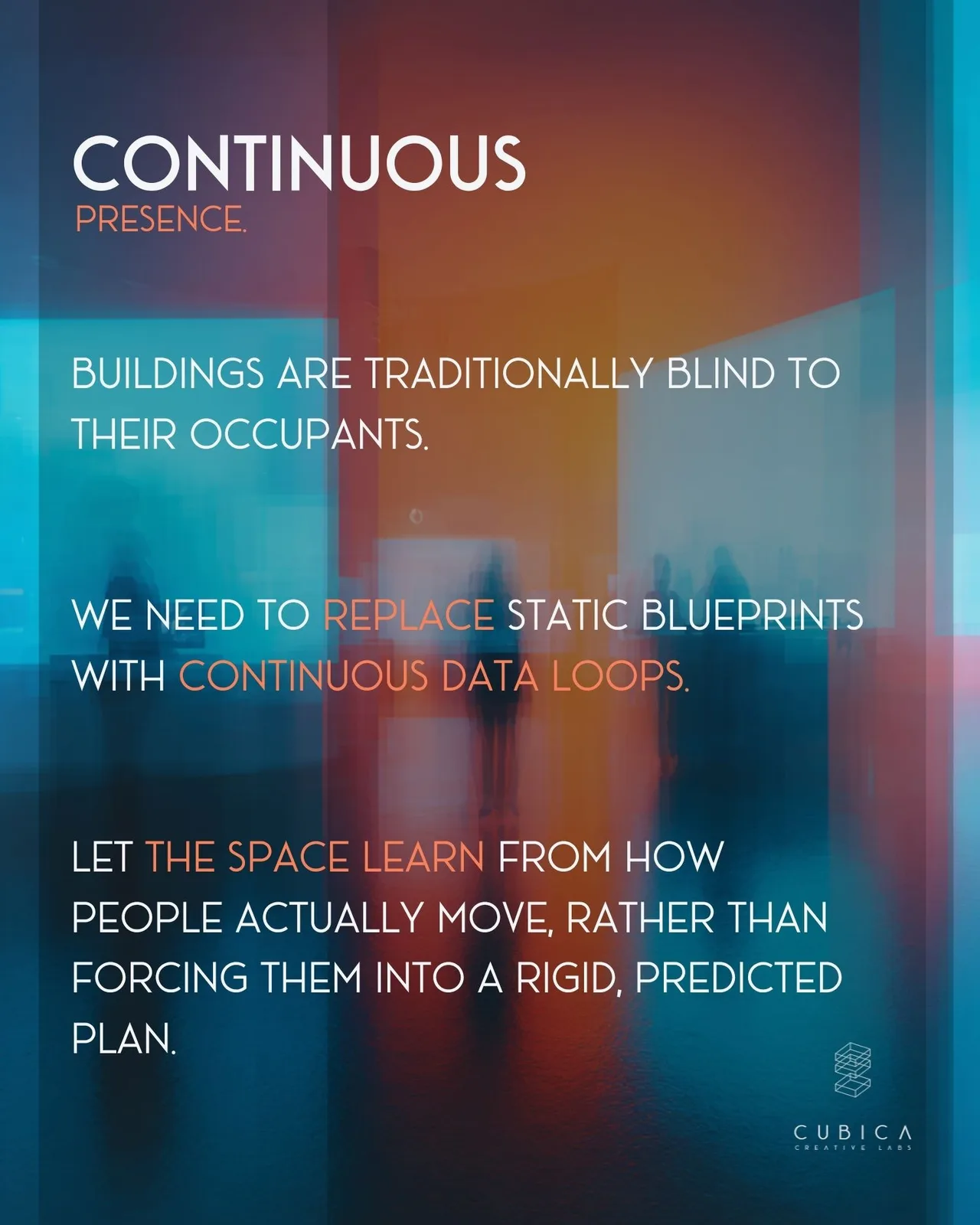
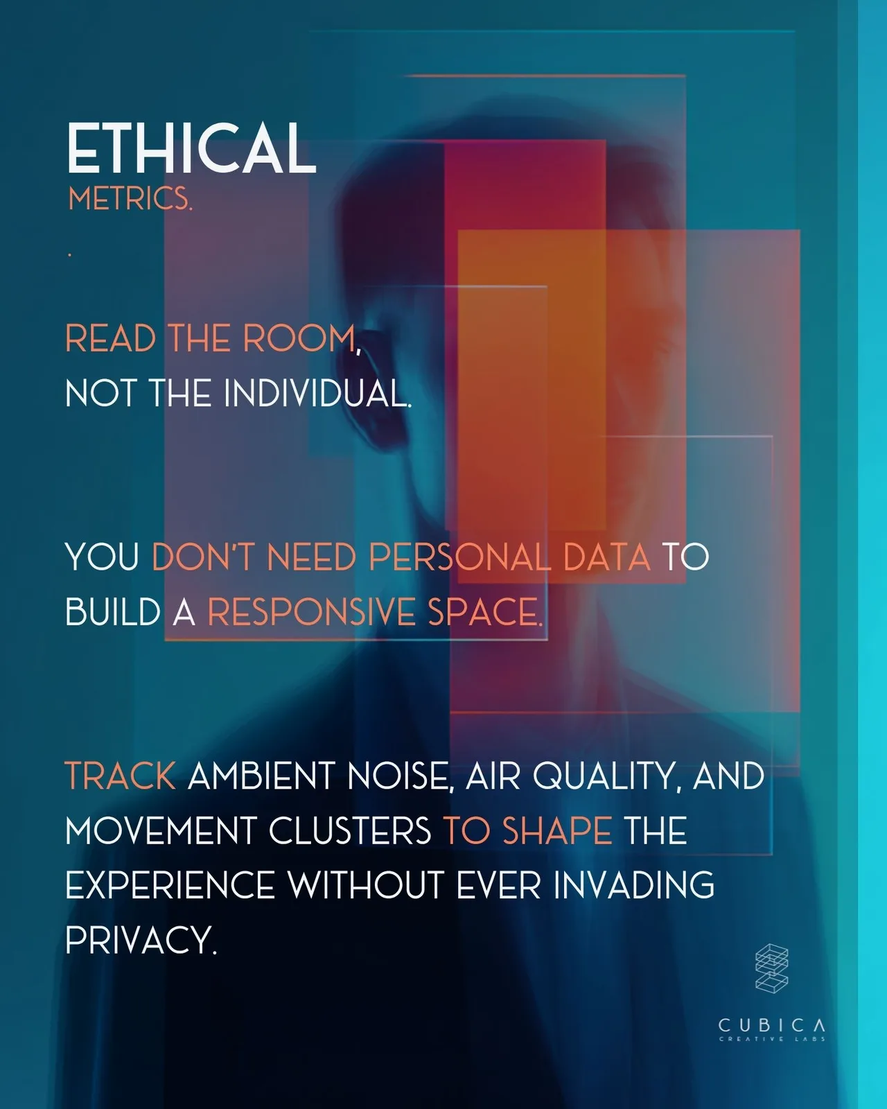
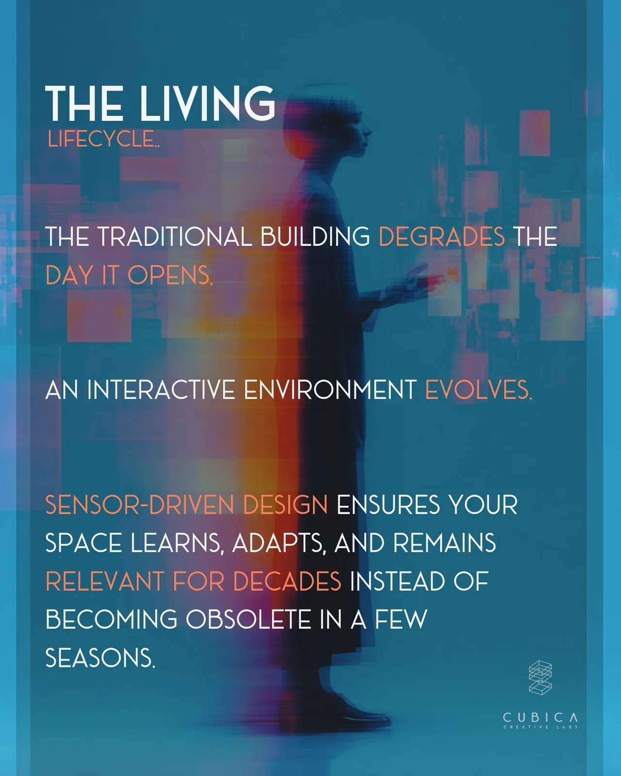
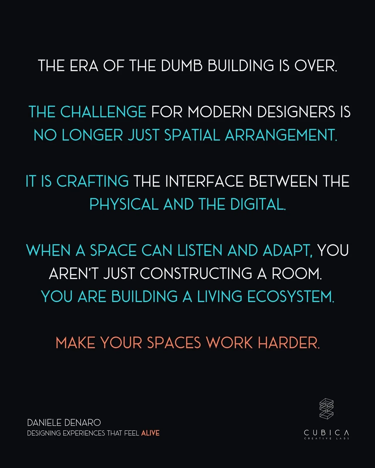
We pour millions into beautiful, static shells that are completely deaf and blind to the people breathing, moving, and working inside them. But I believe this era of the "dumb building" is ending.
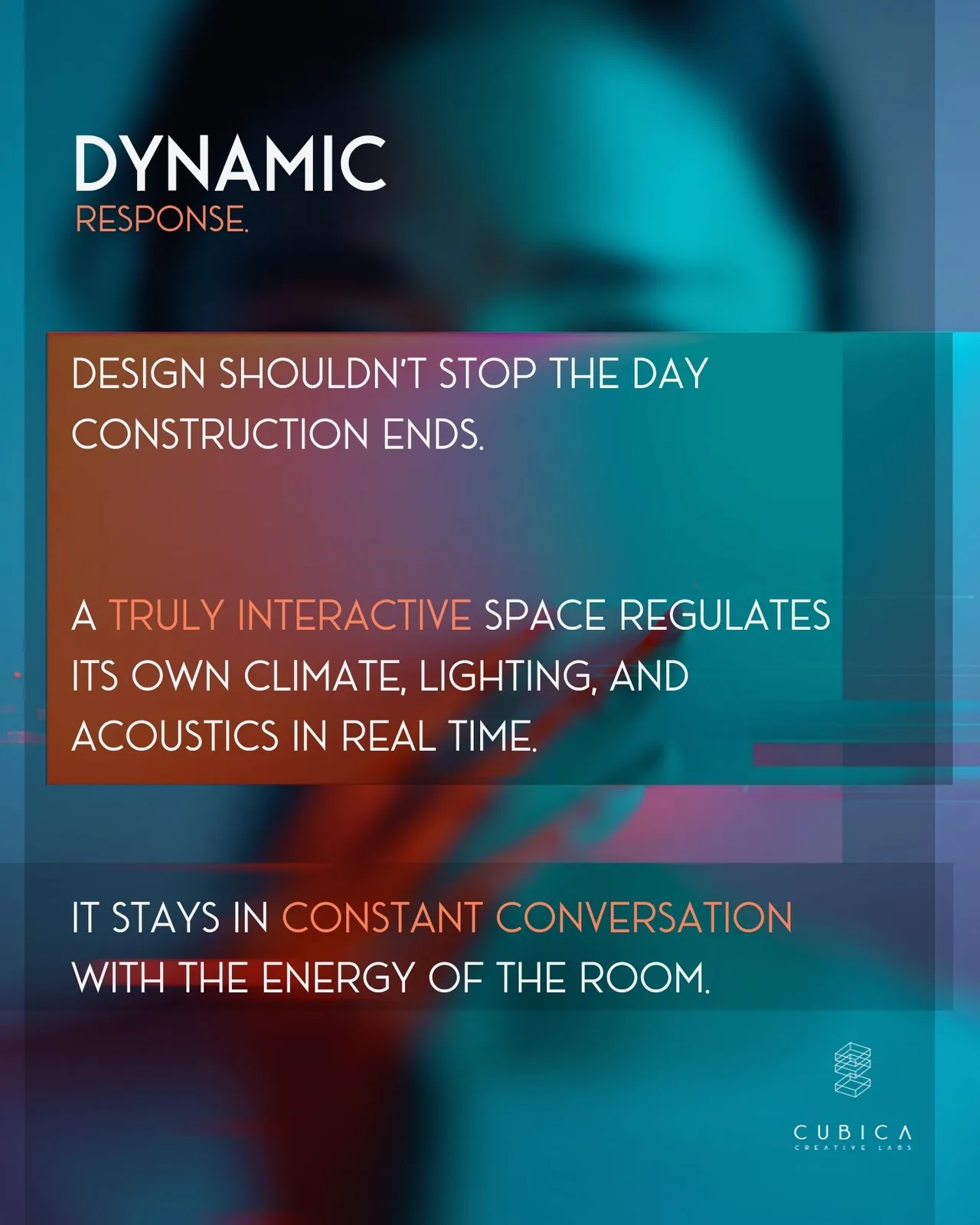
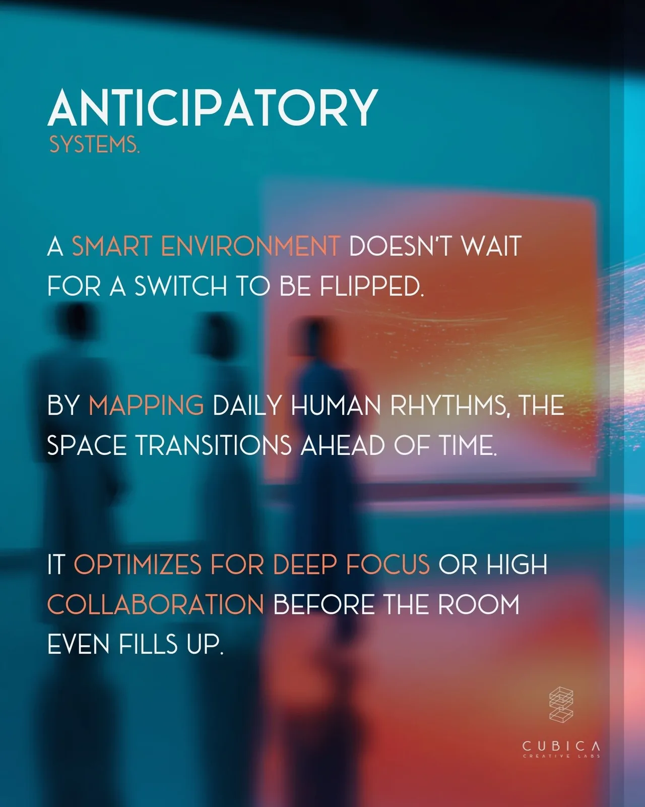
What if a space didn't just contain us, but actually responded to us? By treating spatial design not as a fixed blueprint, but as a continuous feedback loop, I think we can build environments that act more like living organisms. When we use ethical, anonymous data to read the energy of a room, spaces can adjust their climate, lighting, and acoustics before we even realize we need them to.
This is my approach to moving past rigid design and giving architecture a nervous system.
👉 Explore the slides below to see my core principles for transforming blind buildings into spaces that learn and adapt in real time.
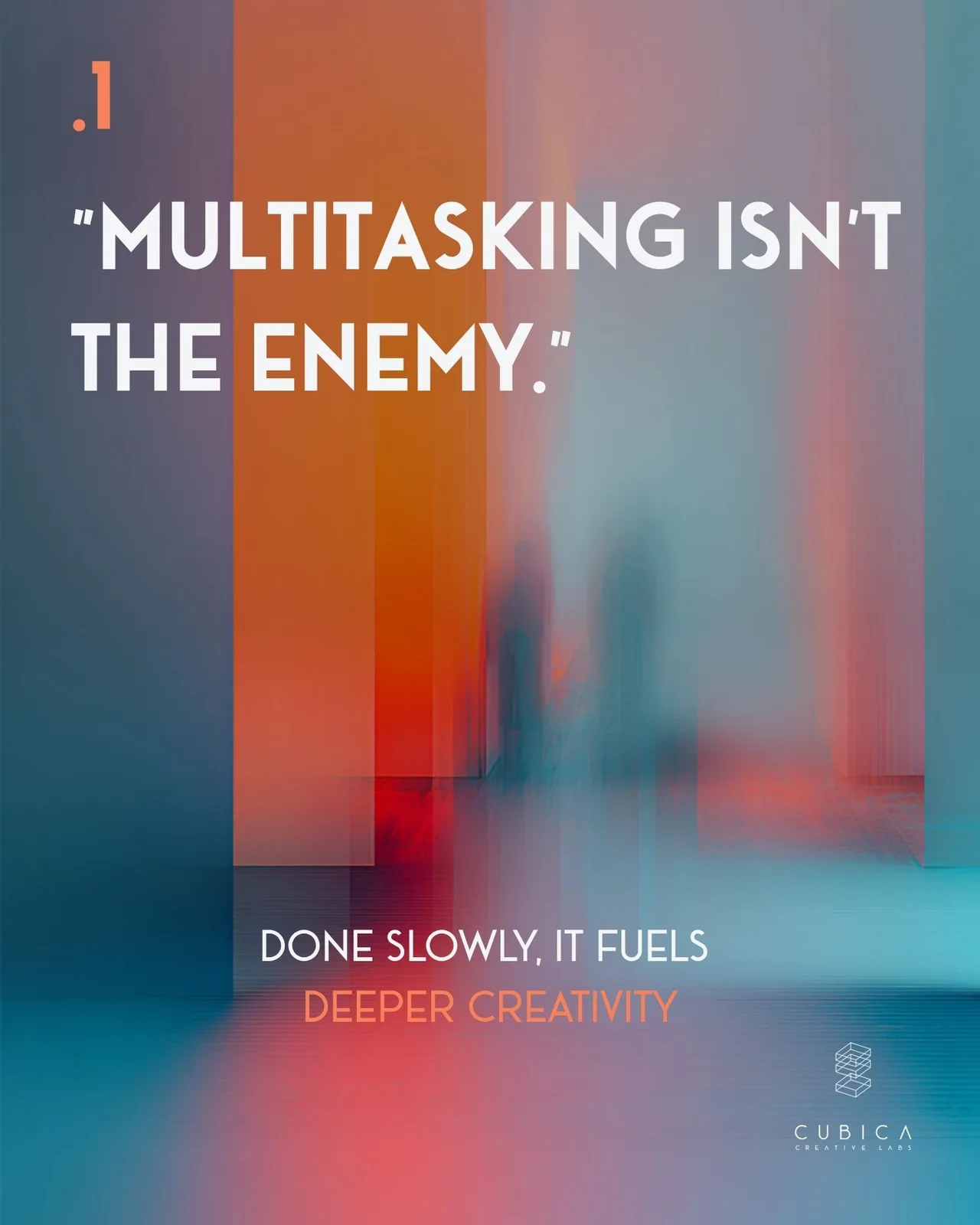
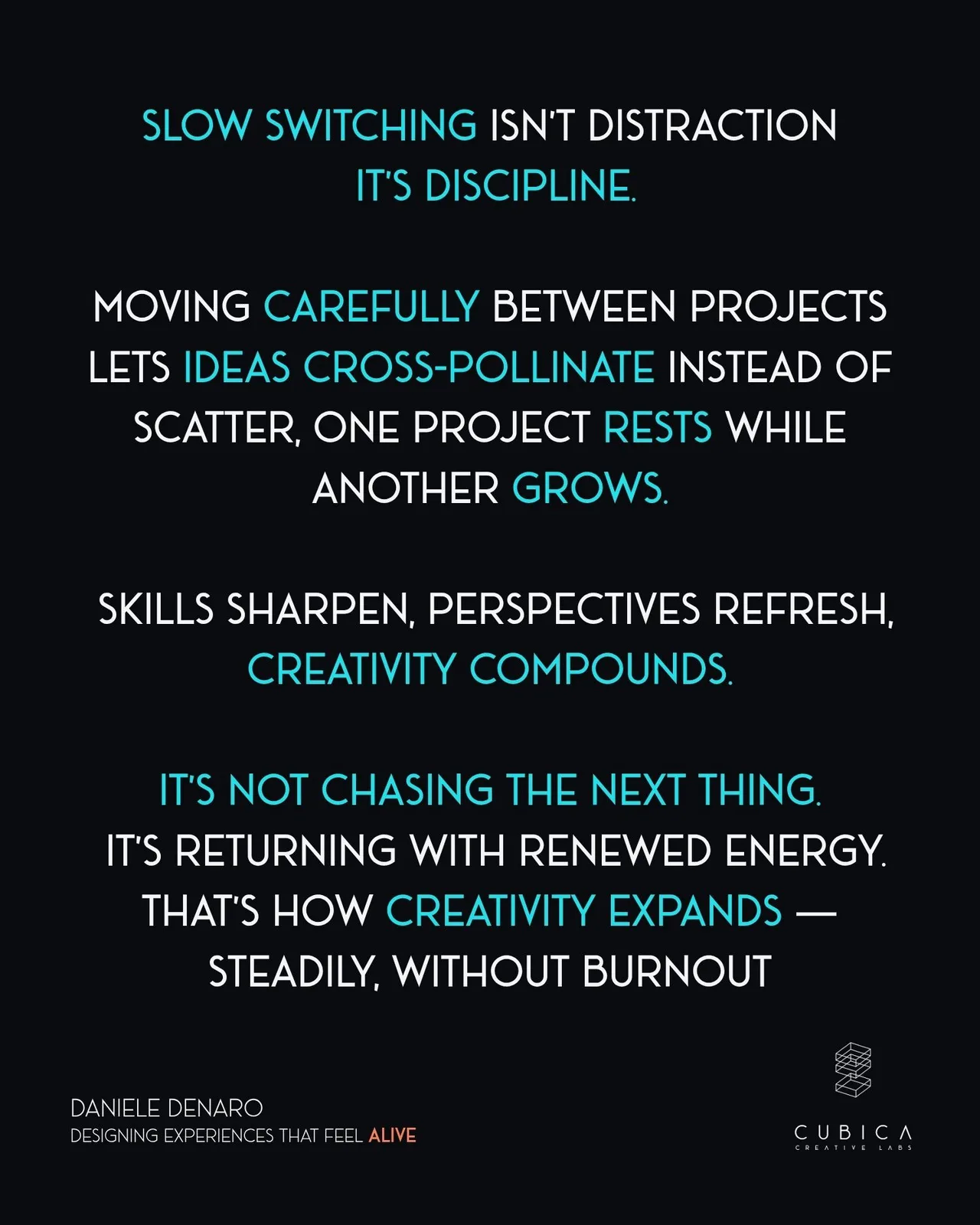
Slow switching is not distraction. It is discipline.
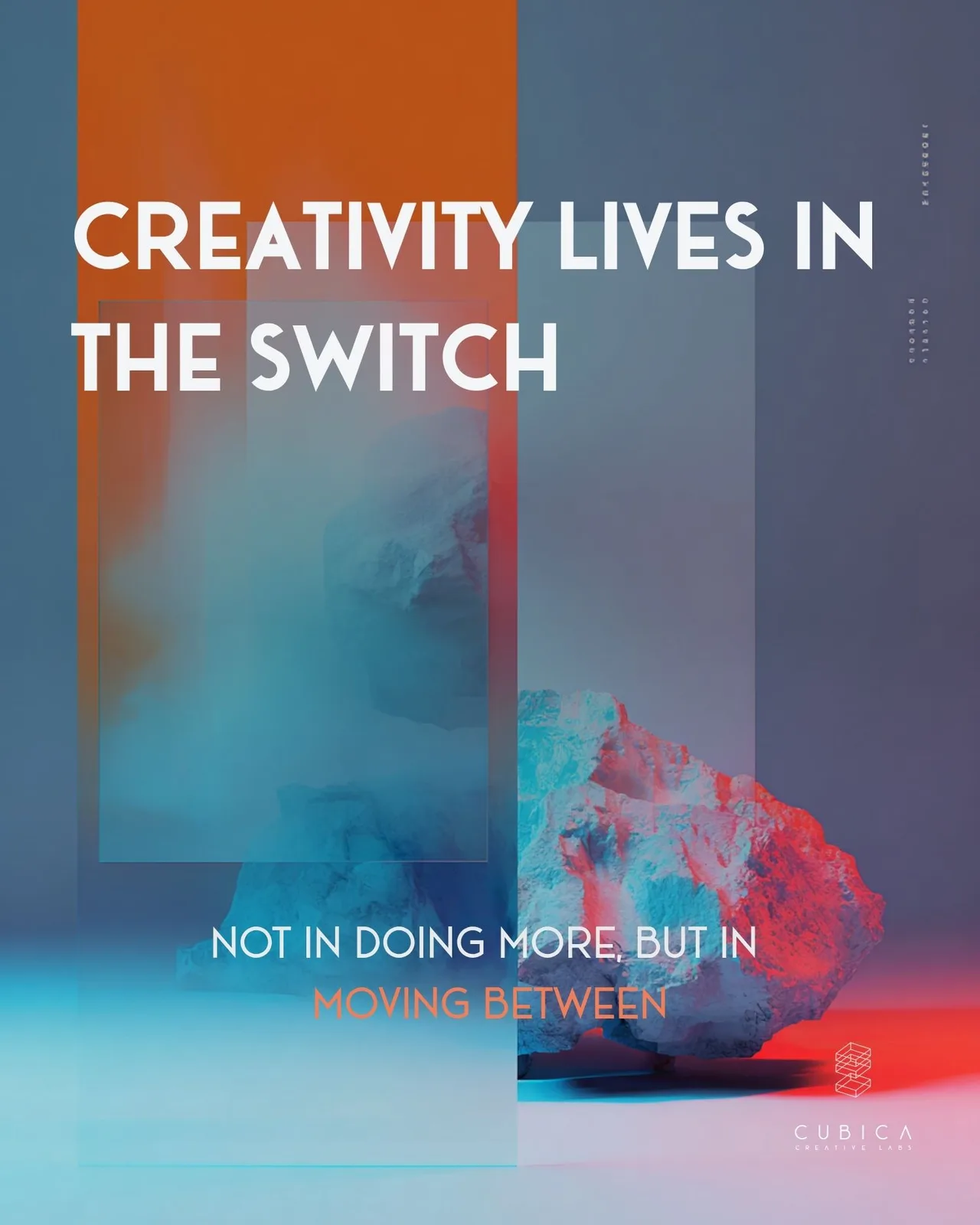
I’ve realized that I don’t produce my best work in a singular, frantic burst.
Instead, my most meaningful breakthroughs happen in the pauses, in the quiet transition between completely different modes of thinking.
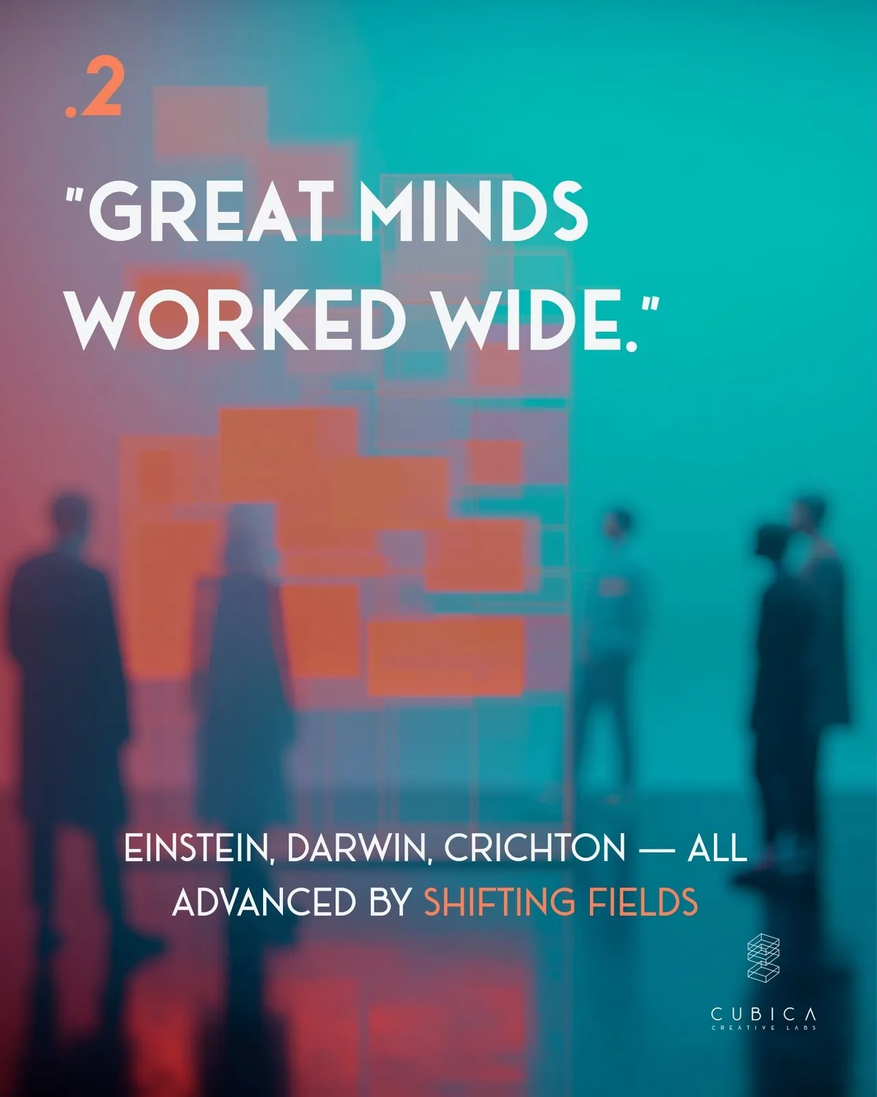
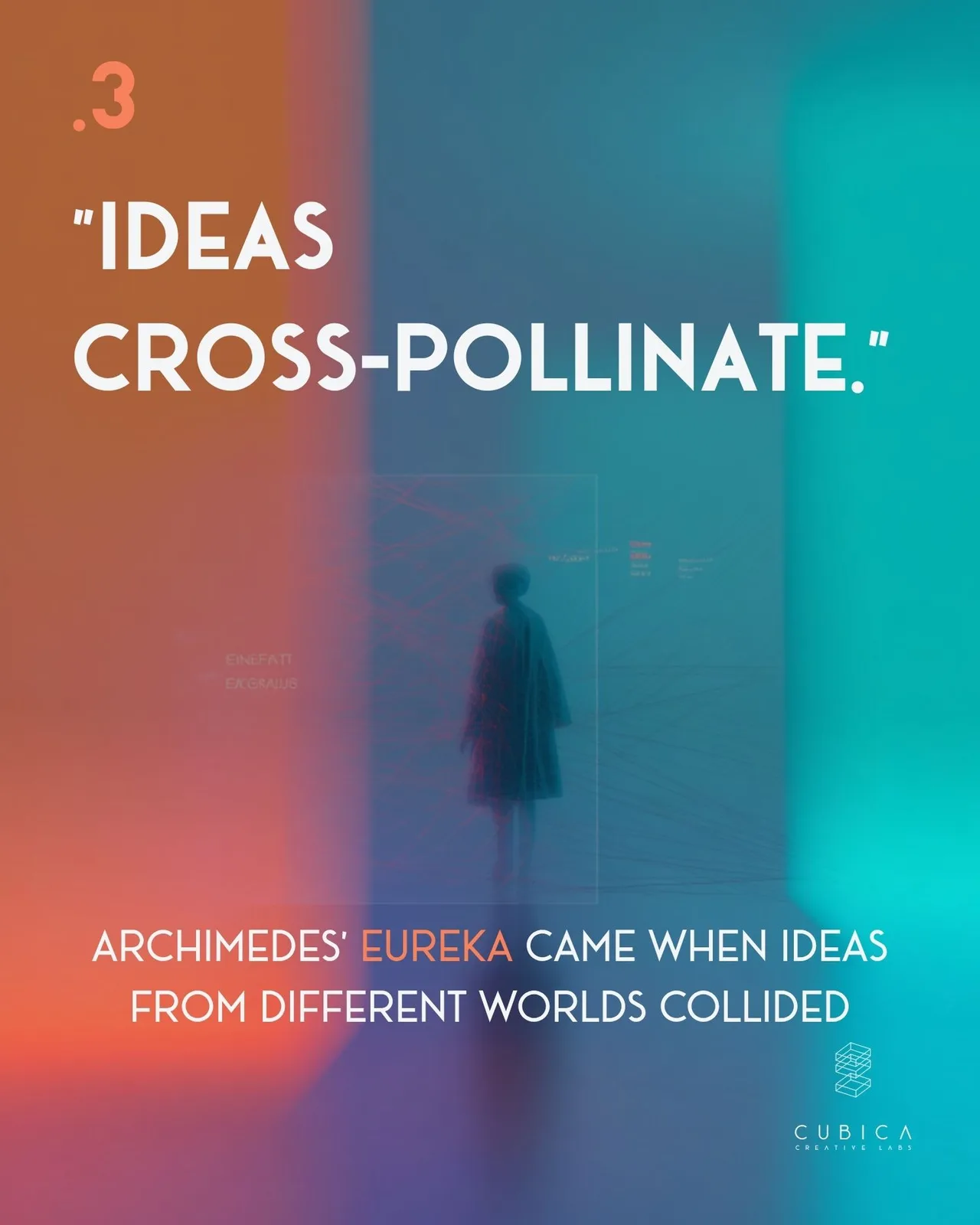
Many of us are taught that multitasking is the enemy, but I’ve found that when practiced slowly, it allows ideas to mature instead of fragmenting under pressure. I treat my workflow like a mosaic, intentionally cross-pollinating concepts from different fields to see where they collide.
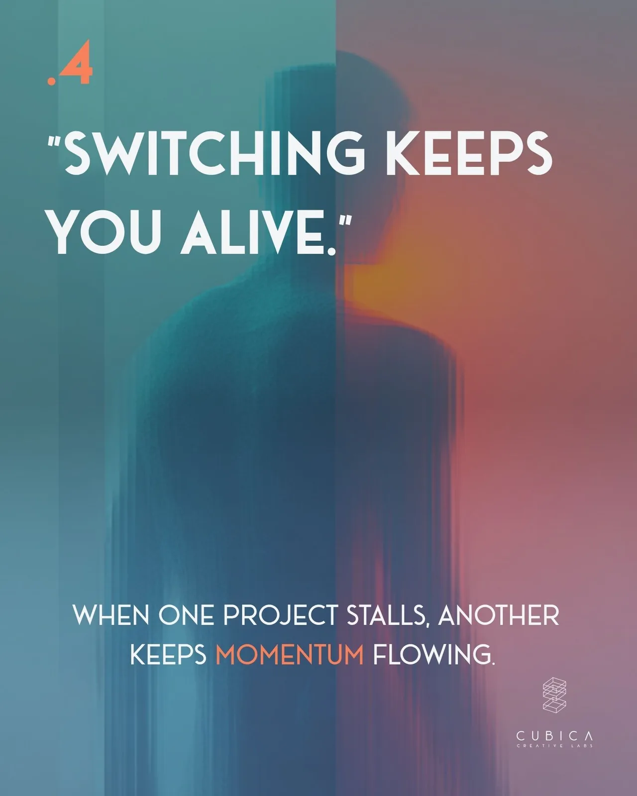
This approach, moving carefully between varied, challenging projects, keeps my momentum flowing and ensures I never hit a creative dead-end.
If you are struggling to stick to one thing, you might just be looking at it the wrong way.
👉 Explore the slides below for my personal framework on why "switching" is the secret to sustaining long-term creative output.
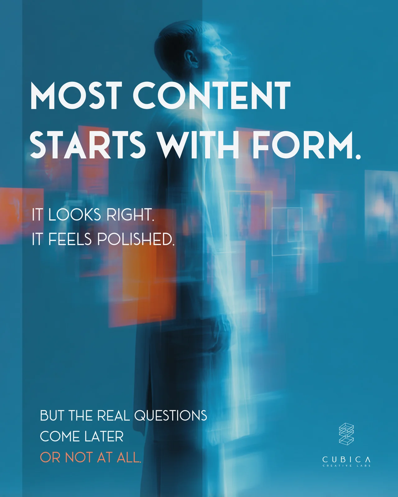
Beautiful design can still fail.
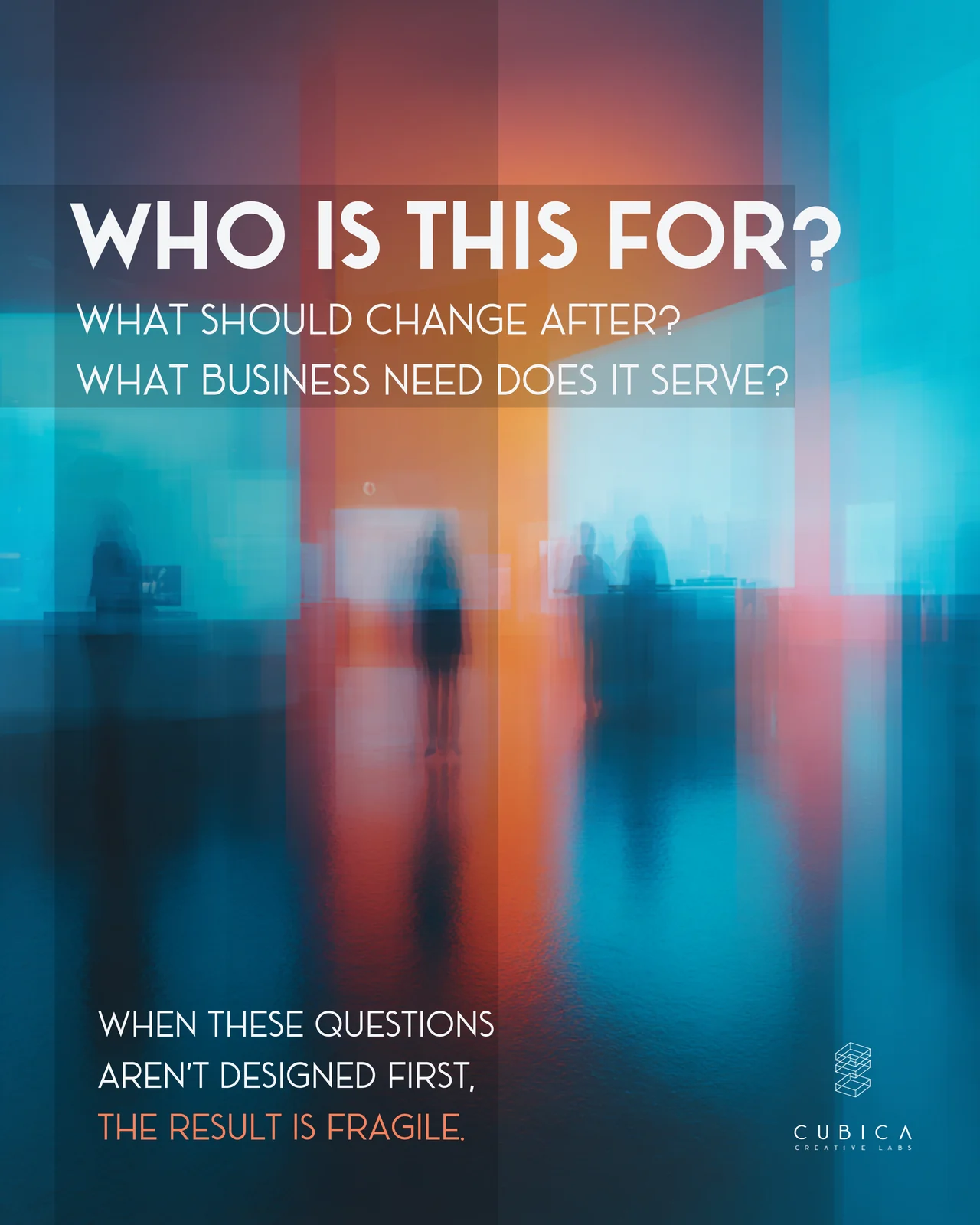
Most content starts with form. It looks right and feels polished, but the important questions come later, or not at all: who is this for, what should change after someone sees it, and what business need does it serve?
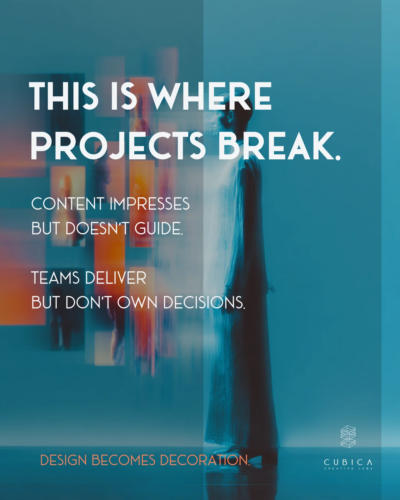
When those questions aren’t answered first, the result is fragile. The content impresses but doesn’t guide, teams deliver without owning the decisions, and design turns into decoration.
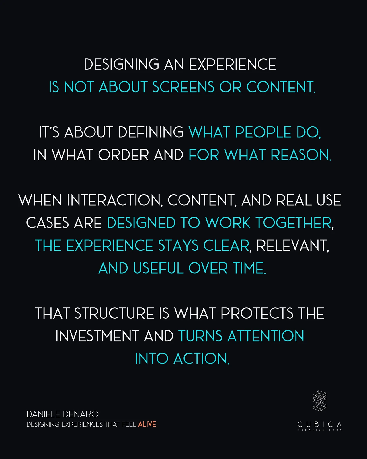
Designing an experience is not about screens or content. It’s about defining what people do, in what order and for what reason. When interaction, content and real use cases are designed to work together, the experience stays clear and useful over time.
👉 Swipe through the slides below to see where projects break, and the questions to answer before designing anything.
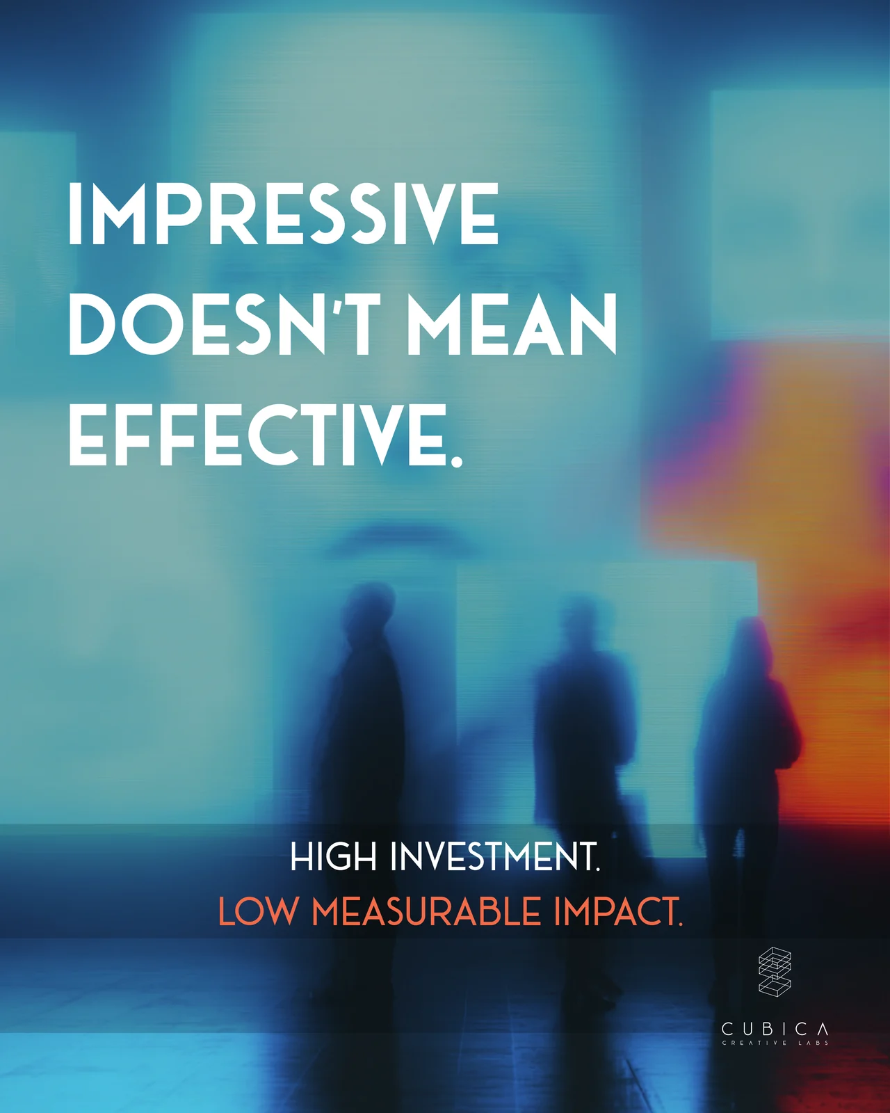
Impressive doesn’t mean effective.
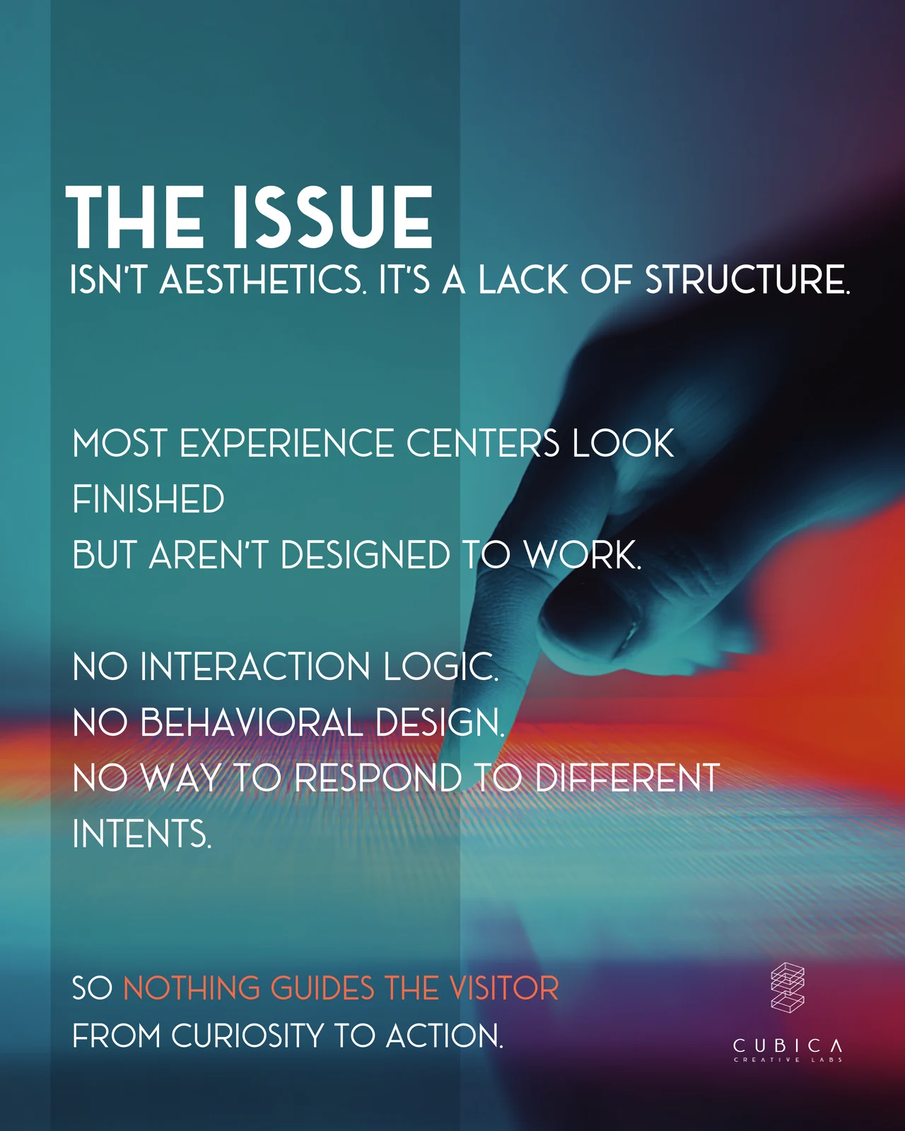
Many experience centers look finished but aren’t designed to work. The investment is high, the measurable impact is low, and the problem is rarely the aesthetics. It’s a lack of structure: no interaction logic, no defined visitor paths, and no way to respond to visitors who come with different intentions.
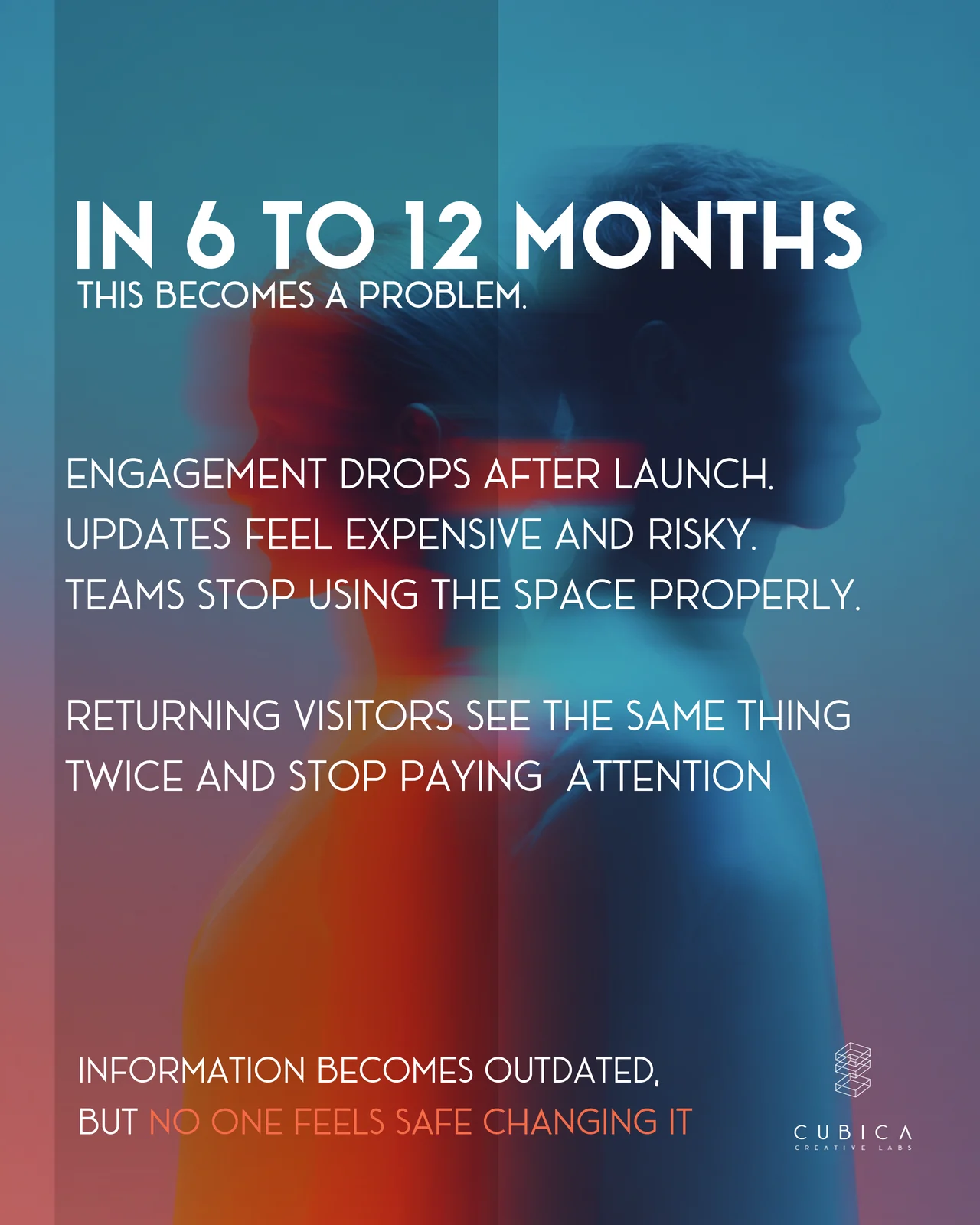
Within 6 to 12 months this shows. Engagement drops after launch, updates feel expensive and risky, and returning visitors see the same thing twice. The information gets outdated, but nobody feels safe changing it.
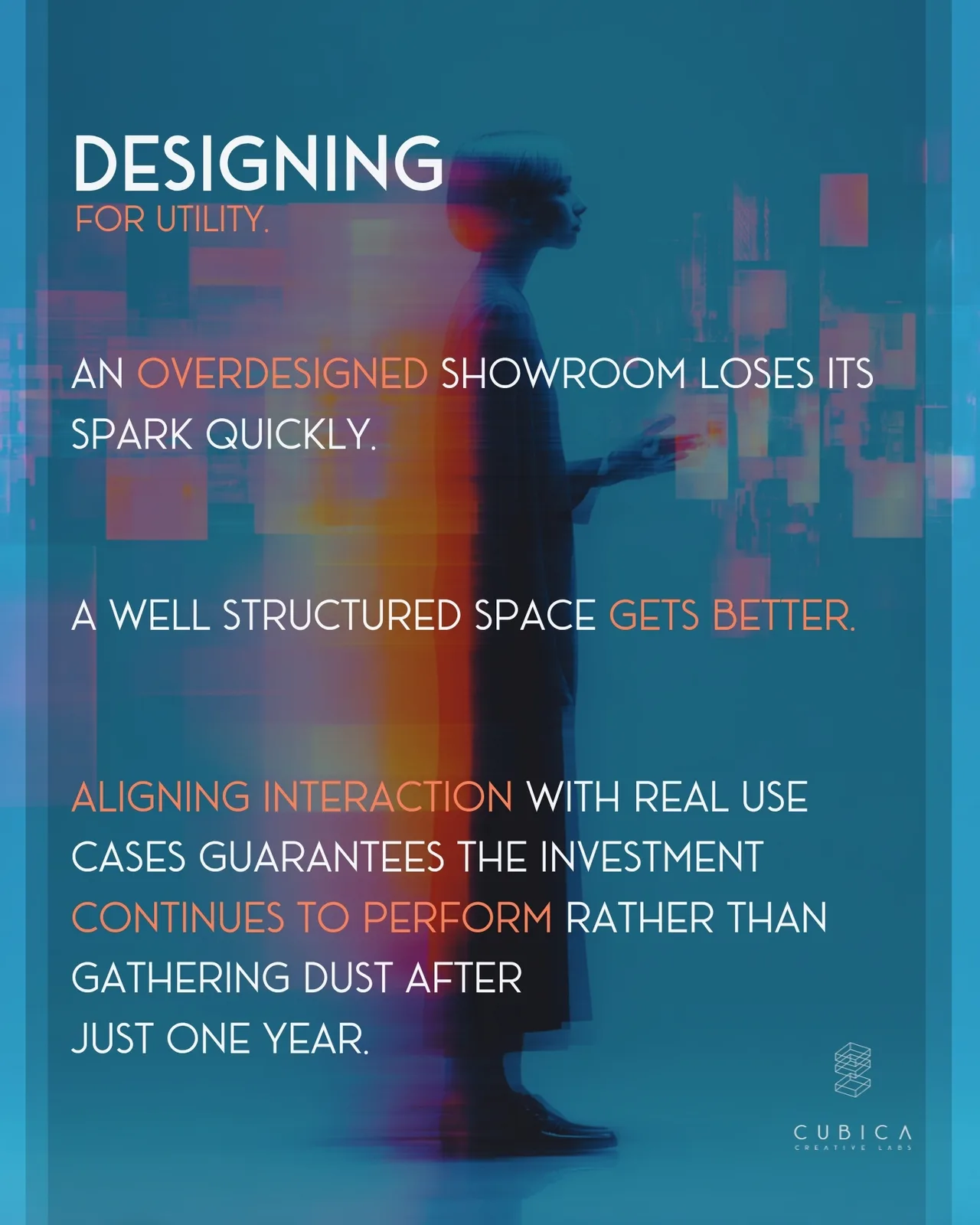
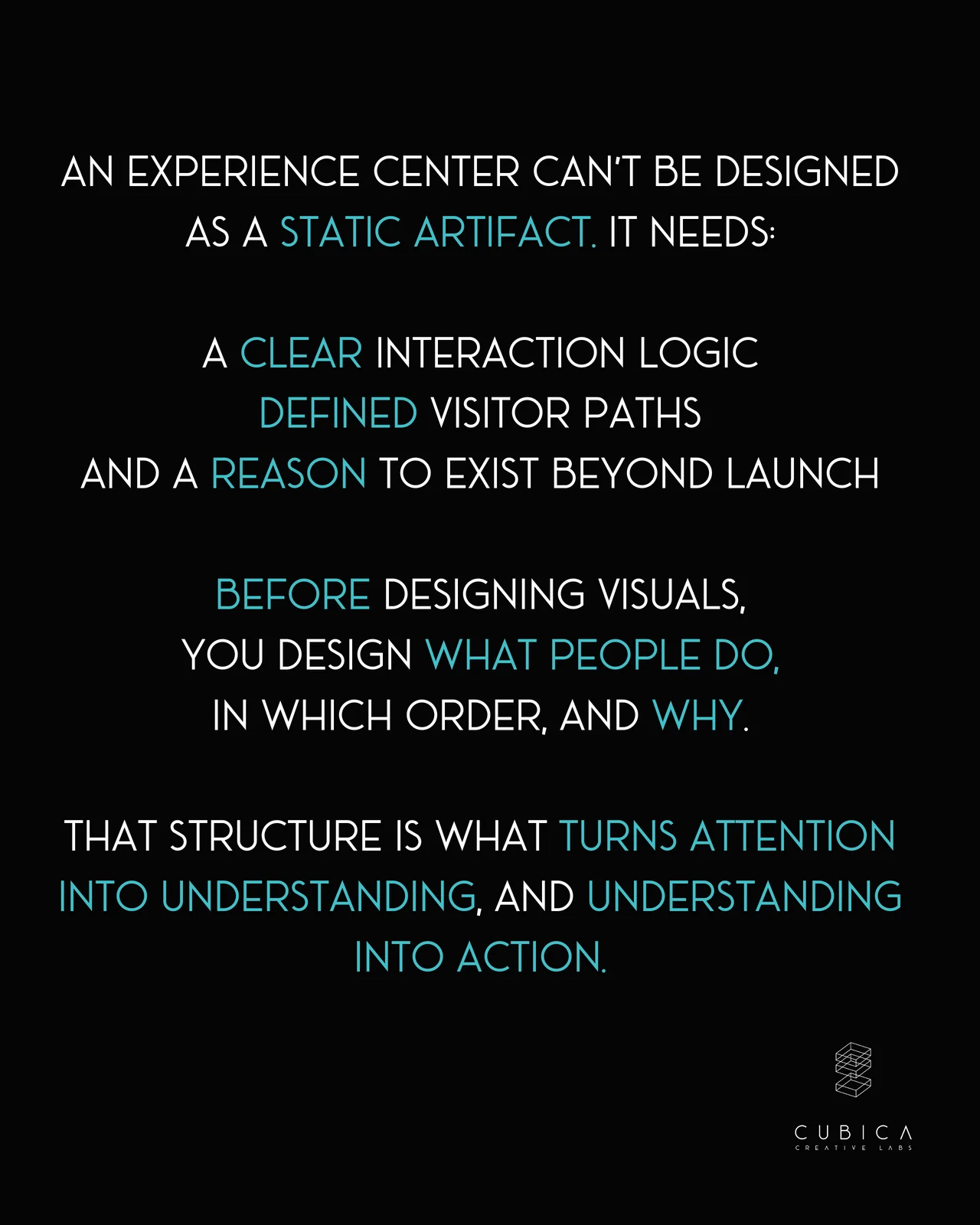
The fix starts before the visuals: design what people do, in which order and why. Build content as modular blocks so updates don’t need a redesign, and connect the space to real use cases such as sales conversations, onboarding, education and decision-making.
👉 Swipe through the slides below to see why impressive spaces lose their impact, and how to structure one that keeps earning its investment.
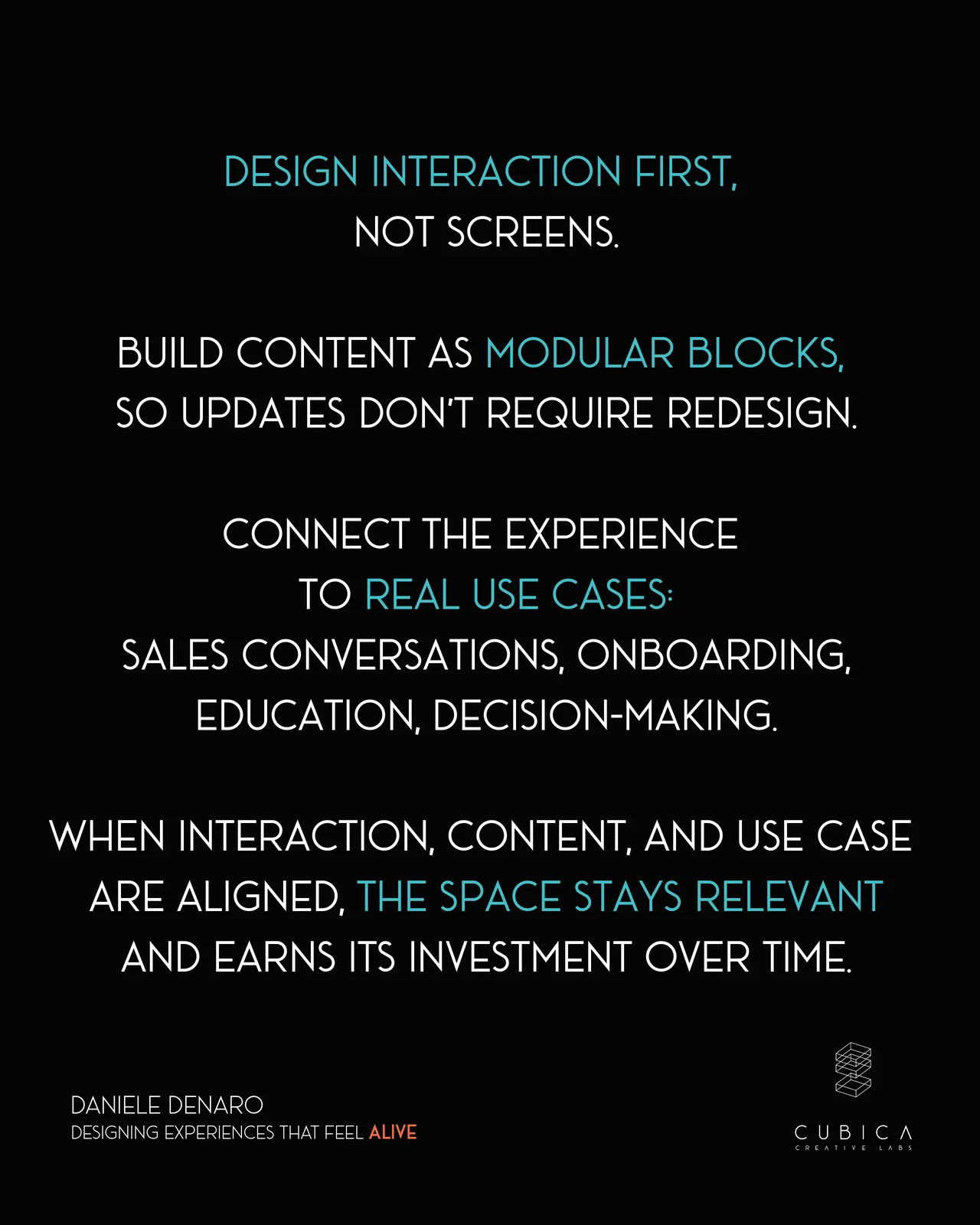
Design behavior, not just visuals.
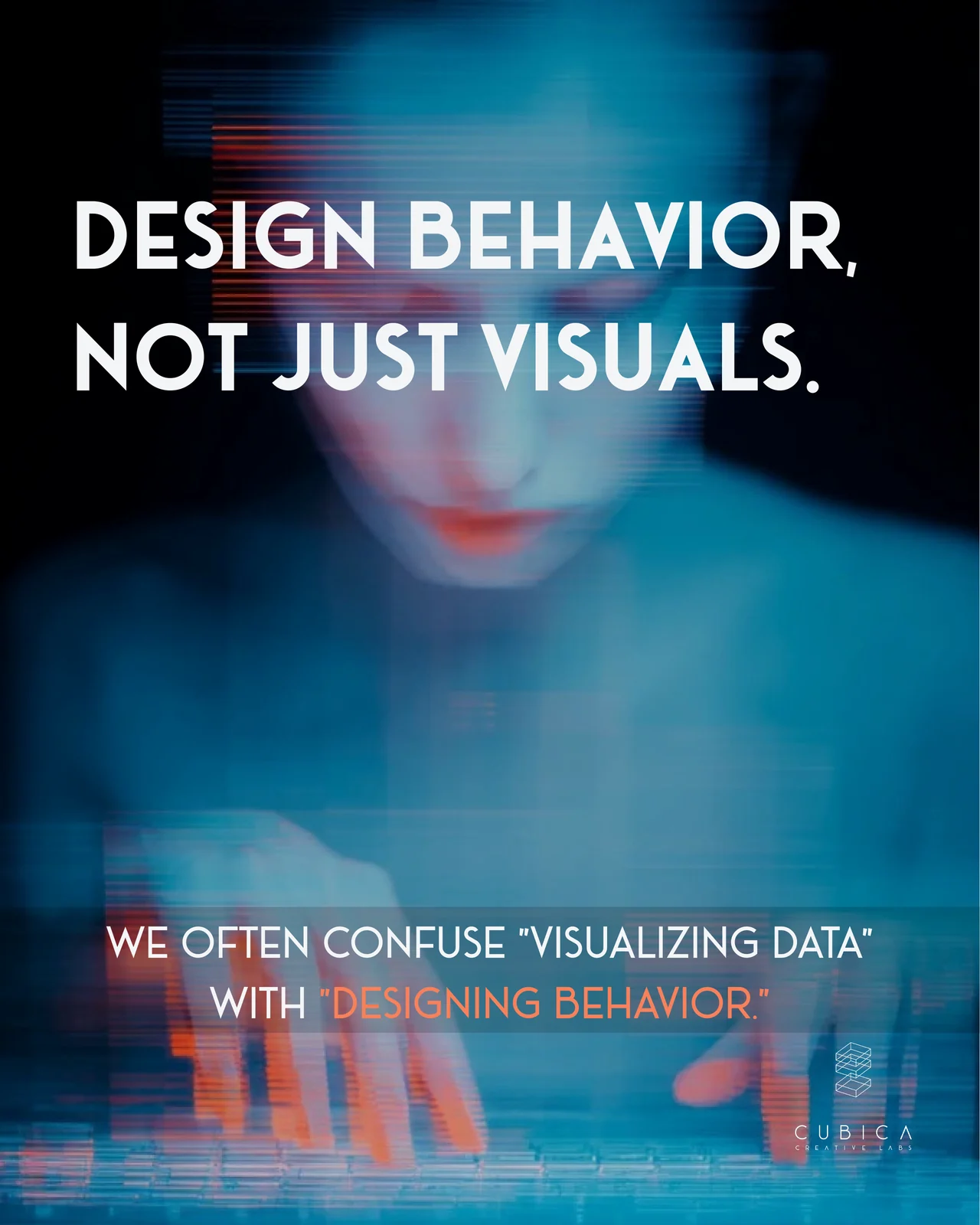
Visualizing data and designing behavior are often treated as the same thing. If you put a spreadsheet on a wall in a Customer Experience Center, you haven’t created an experience. You’ve created a large monitor.
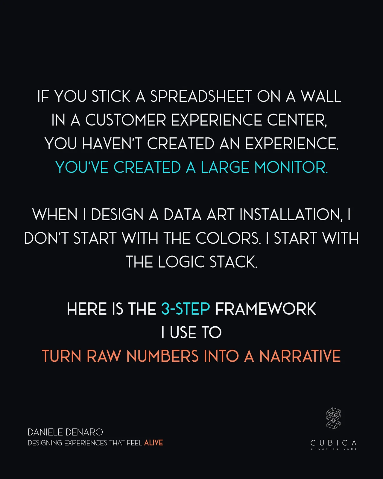
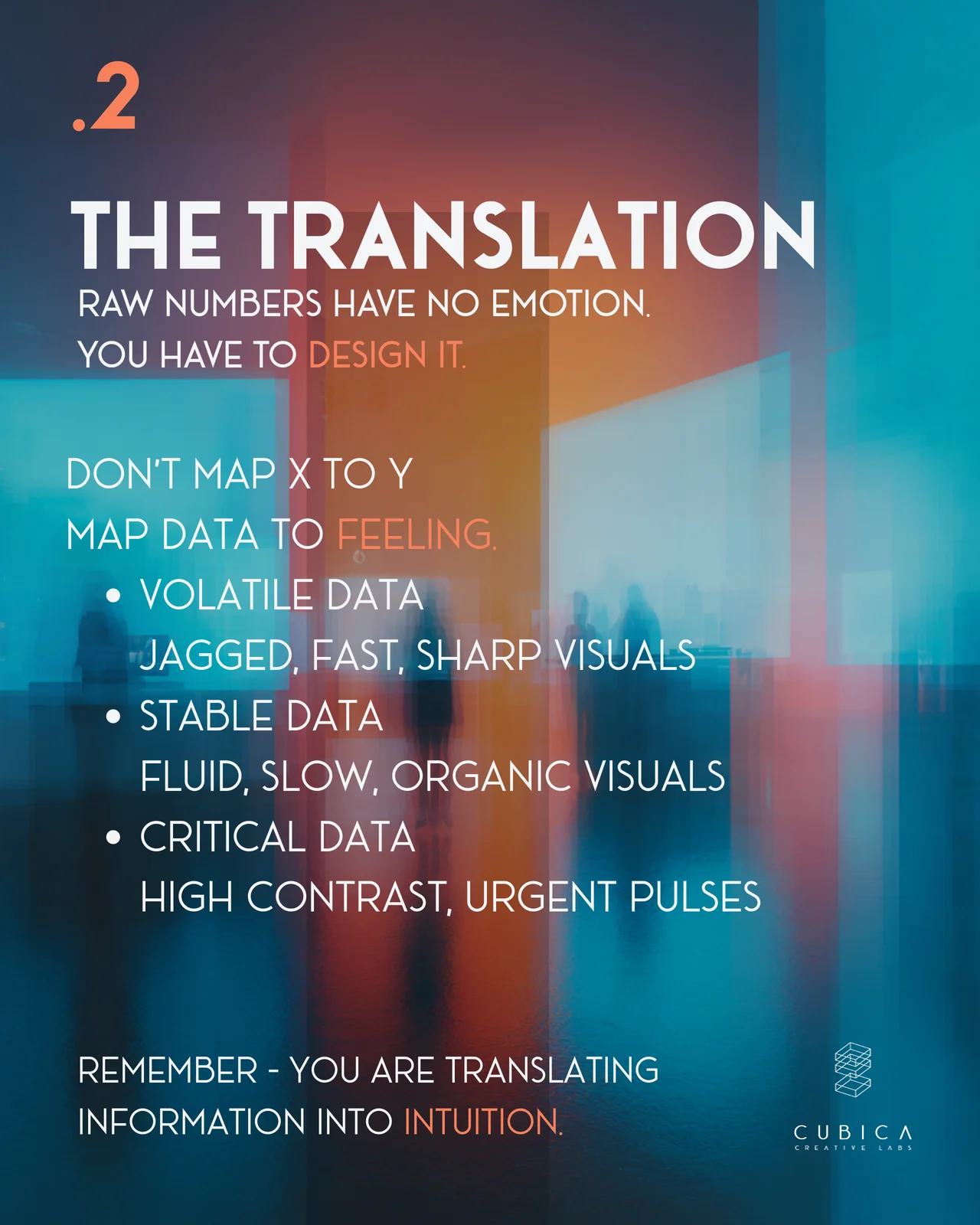
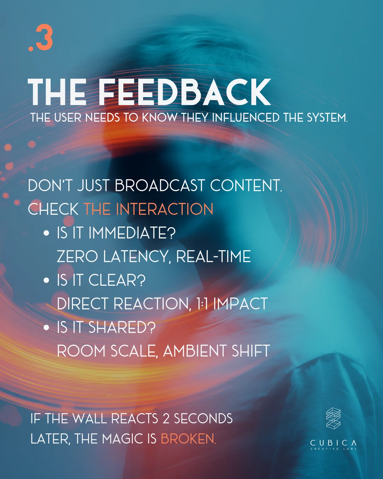
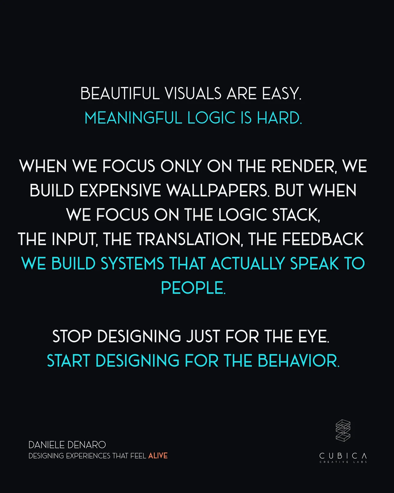
When I design a data art installation, I don’t start with the colors. I start with the Logic Stack, a three-step framework that turns raw numbers into a narrative.
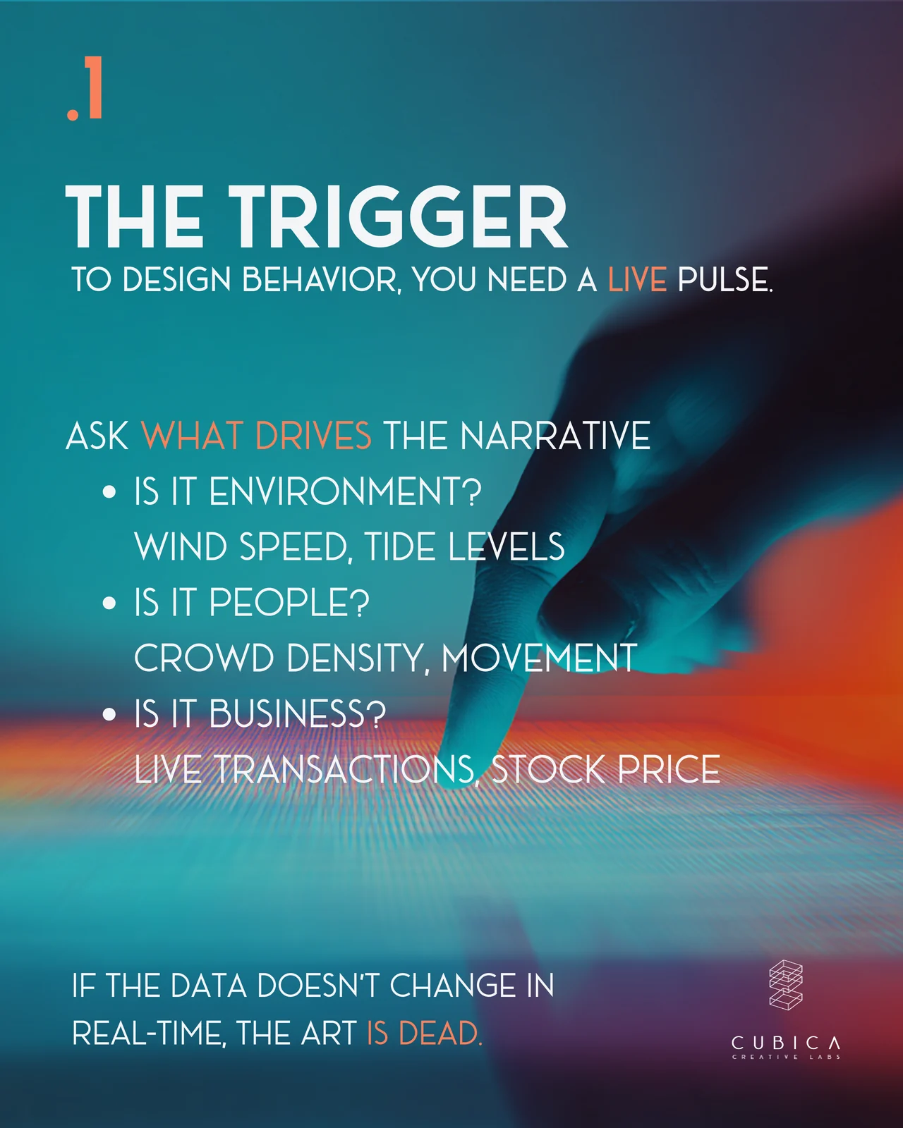
The trigger: a live data source that drives the story, coming from the environment, from people or from the business. The translation: mapping data to feeling, so volatile data looks sharp and fast and stable data looks slow and fluid. The feedback: visitors need to see, immediately and clearly, that they influenced the system.
Beautiful visuals are easy. Meaningful logic is the hard part.
👉 Swipe through the slides below for the full framework and the questions I use at each step.
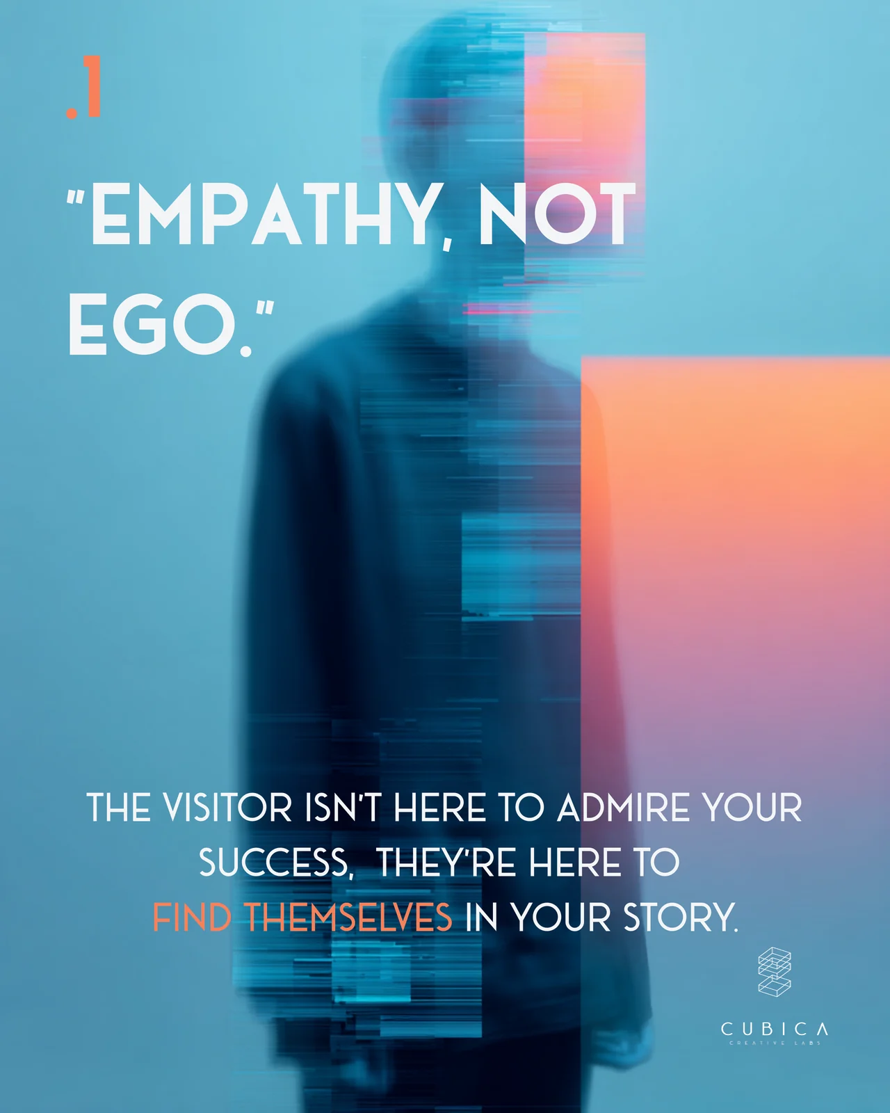
Human, not corporate.
The visitor isn’t there to admire your success. They’re there to find themselves in your story.
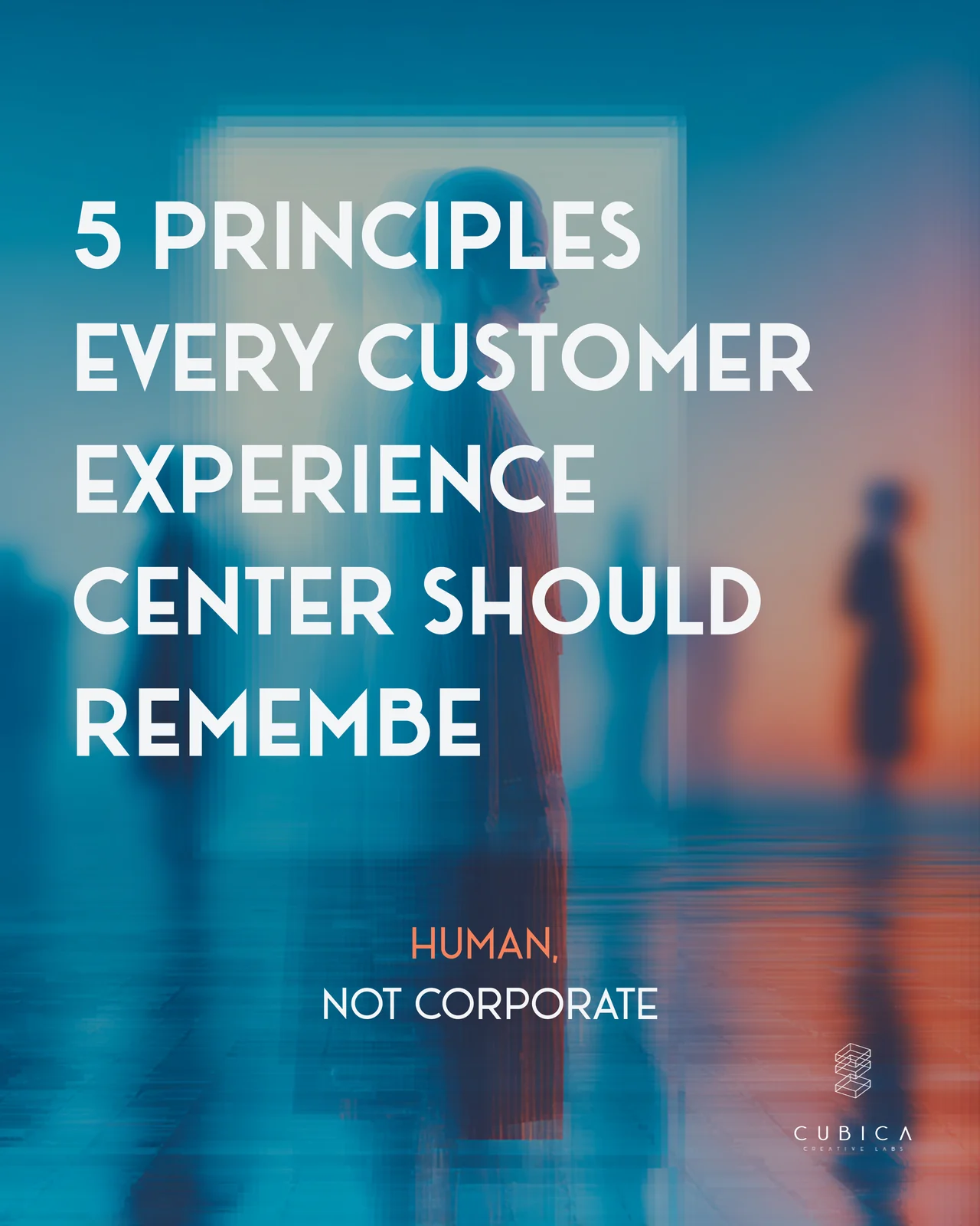
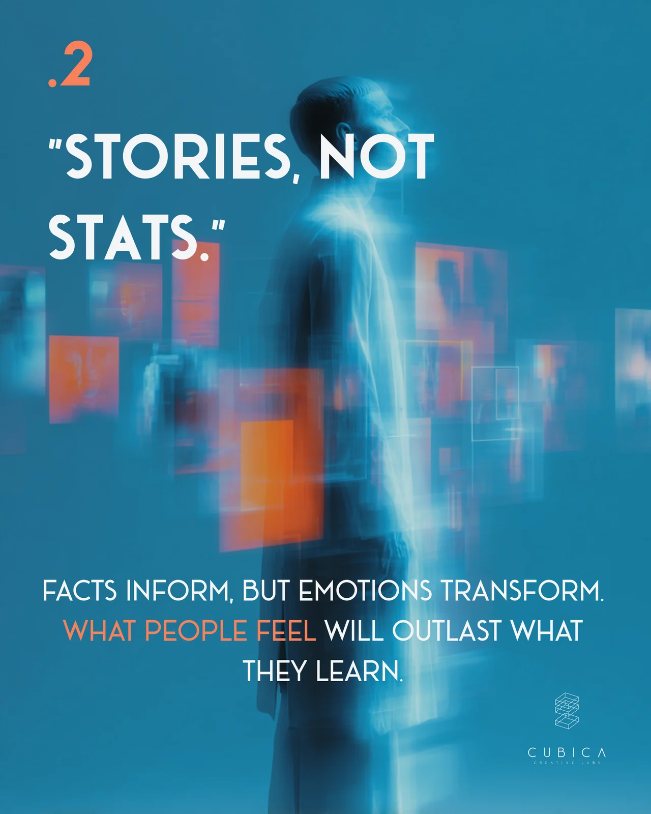
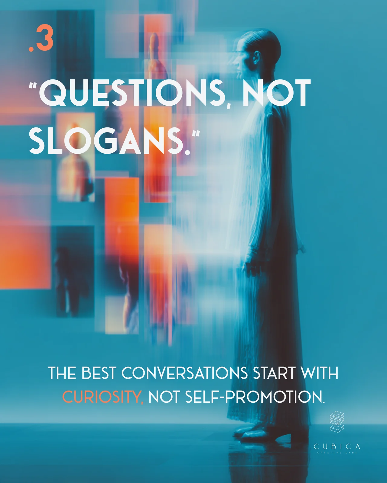
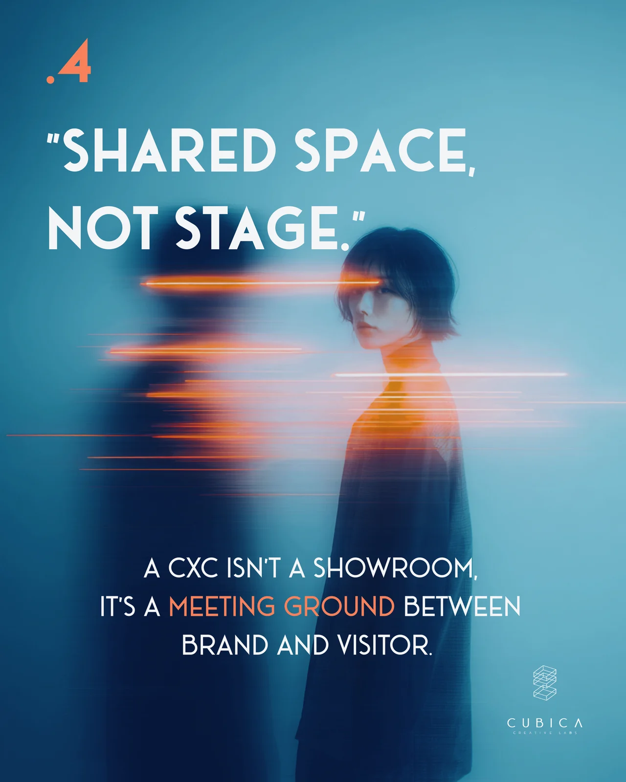
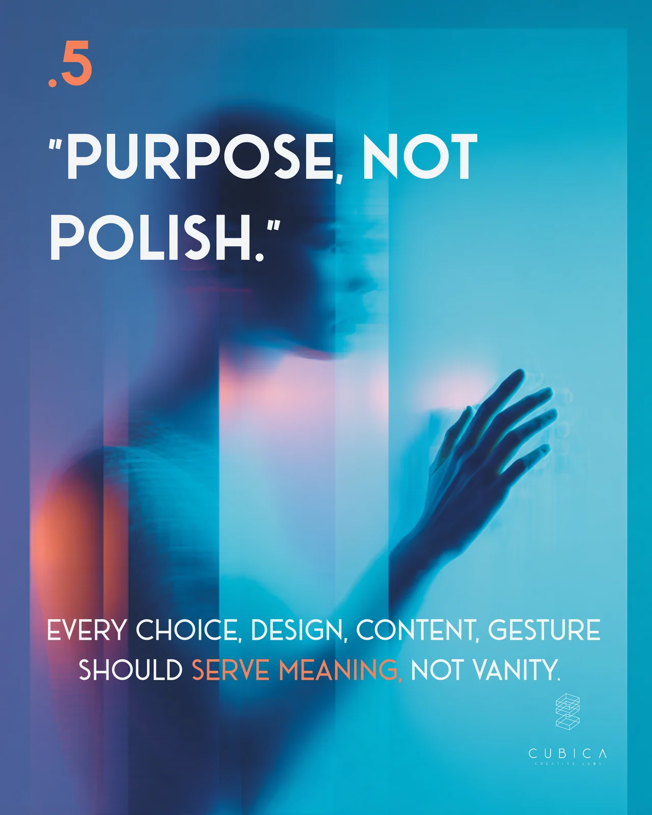
Five principles every Customer Experience Center should remember: empathy, not ego. Stories, not stats. Questions, not slogans. A shared space, not a stage. Purpose, not polish.
Facts inform, but what people feel stays with them longer than what they learn. The best conversations start with curiosity rather than self-promotion, and every design and content choice should serve meaning, not vanity. The best experience doesn’t talk about you. It makes people feel part of it.
👉 Swipe through the slides below to read the five principles.
7 things every digital experience should make you feel.
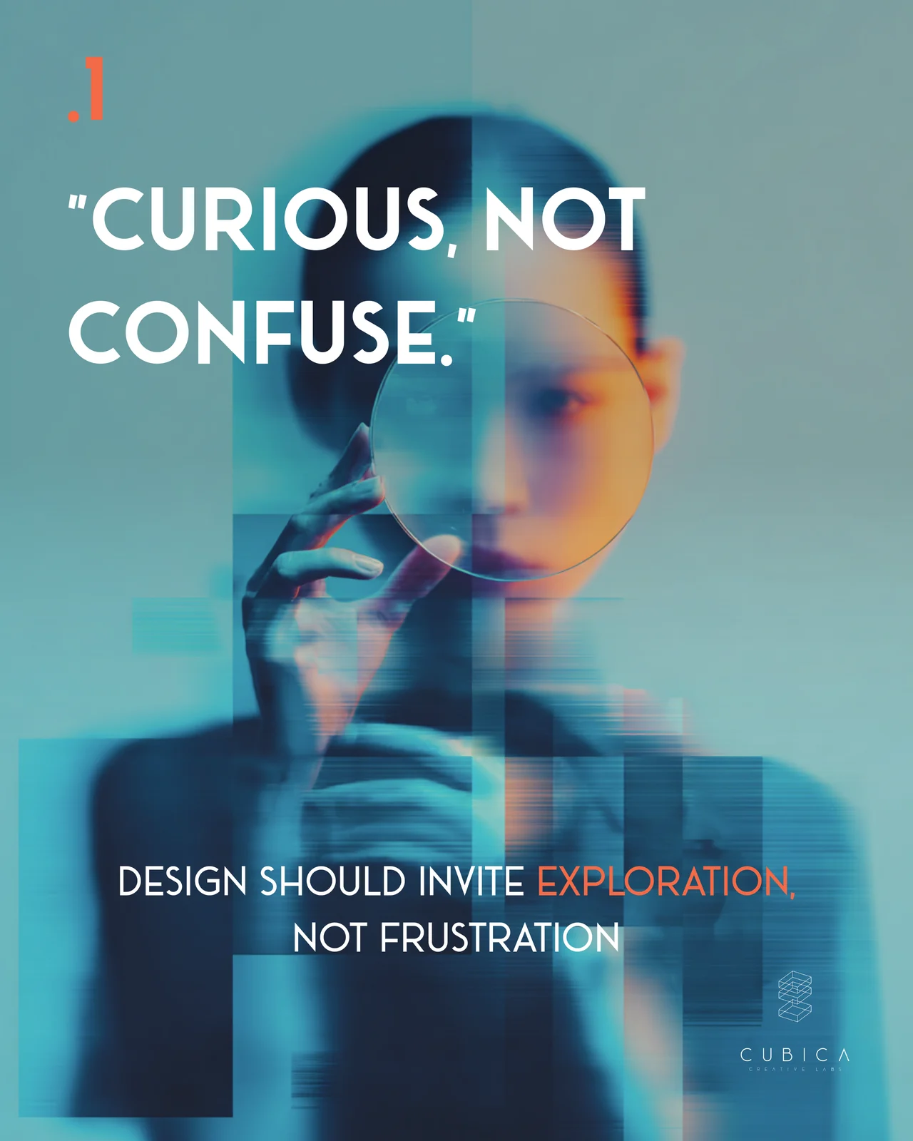
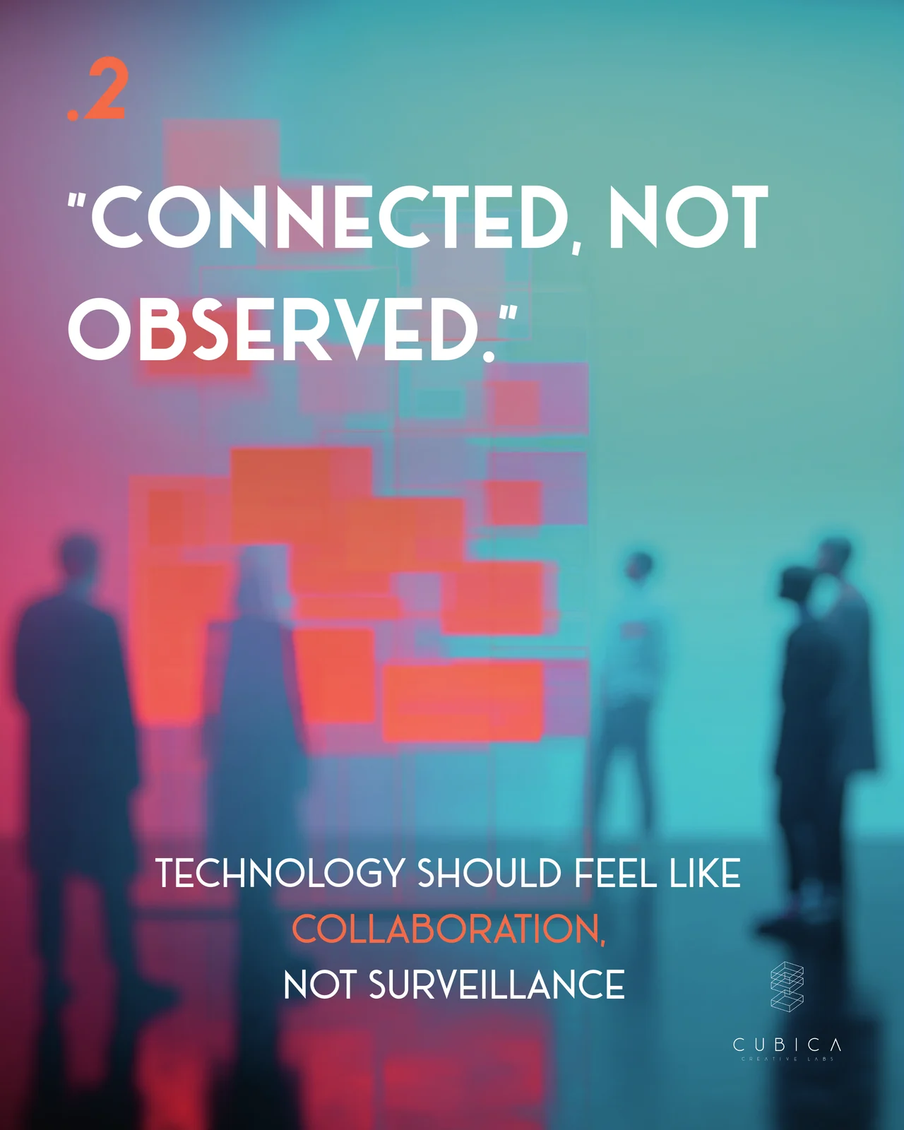
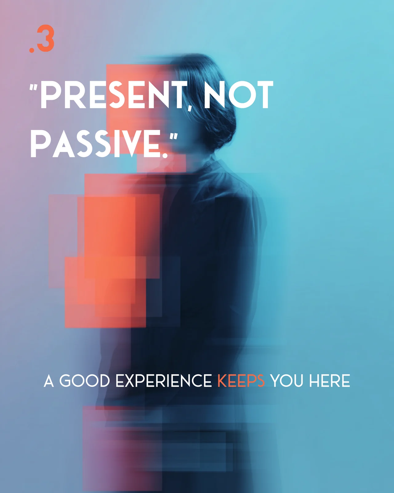
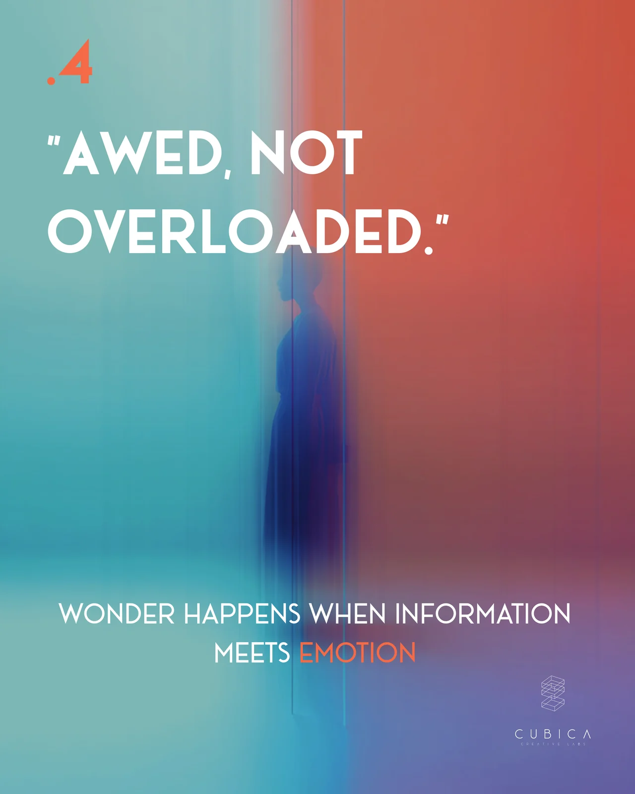
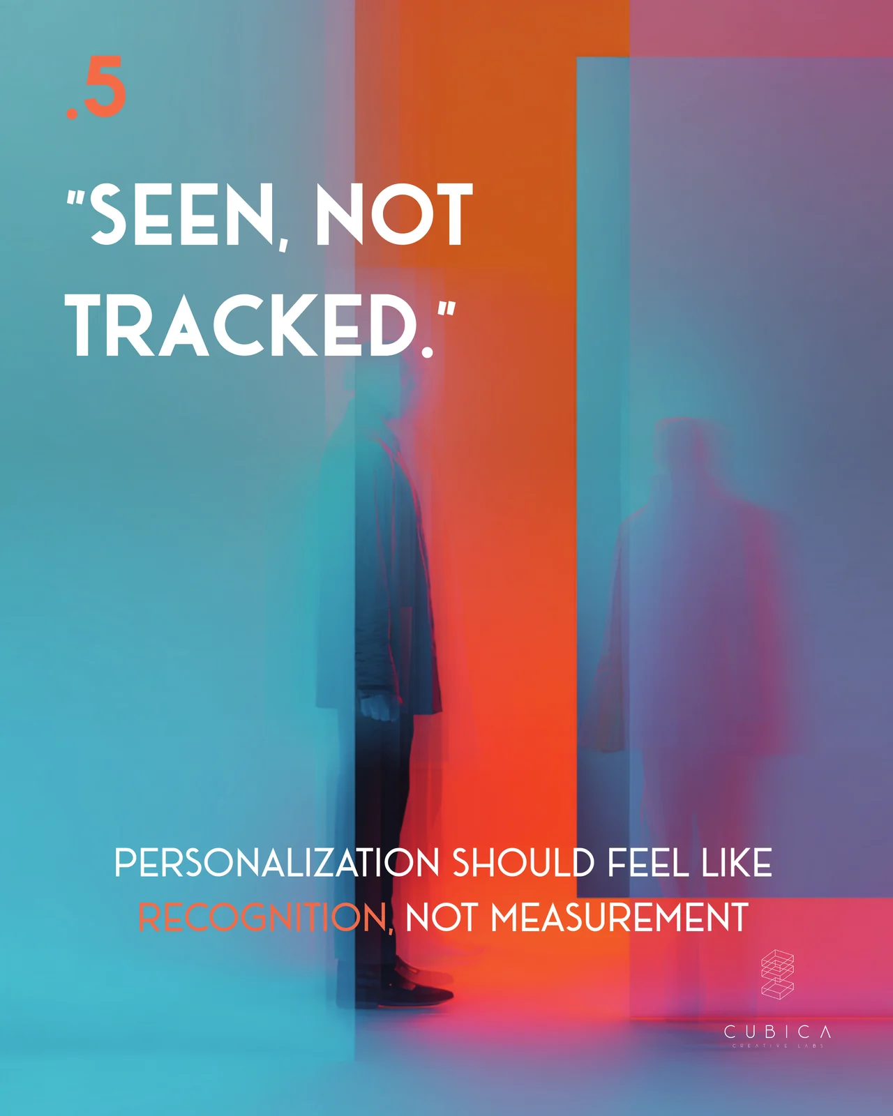
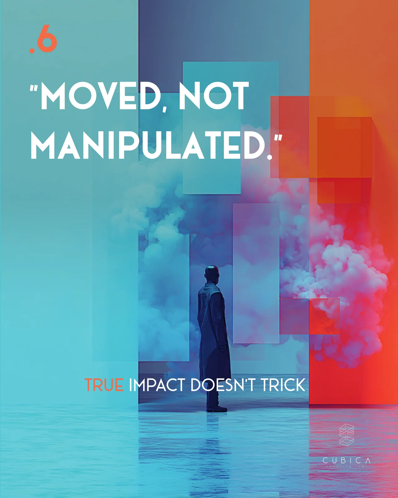
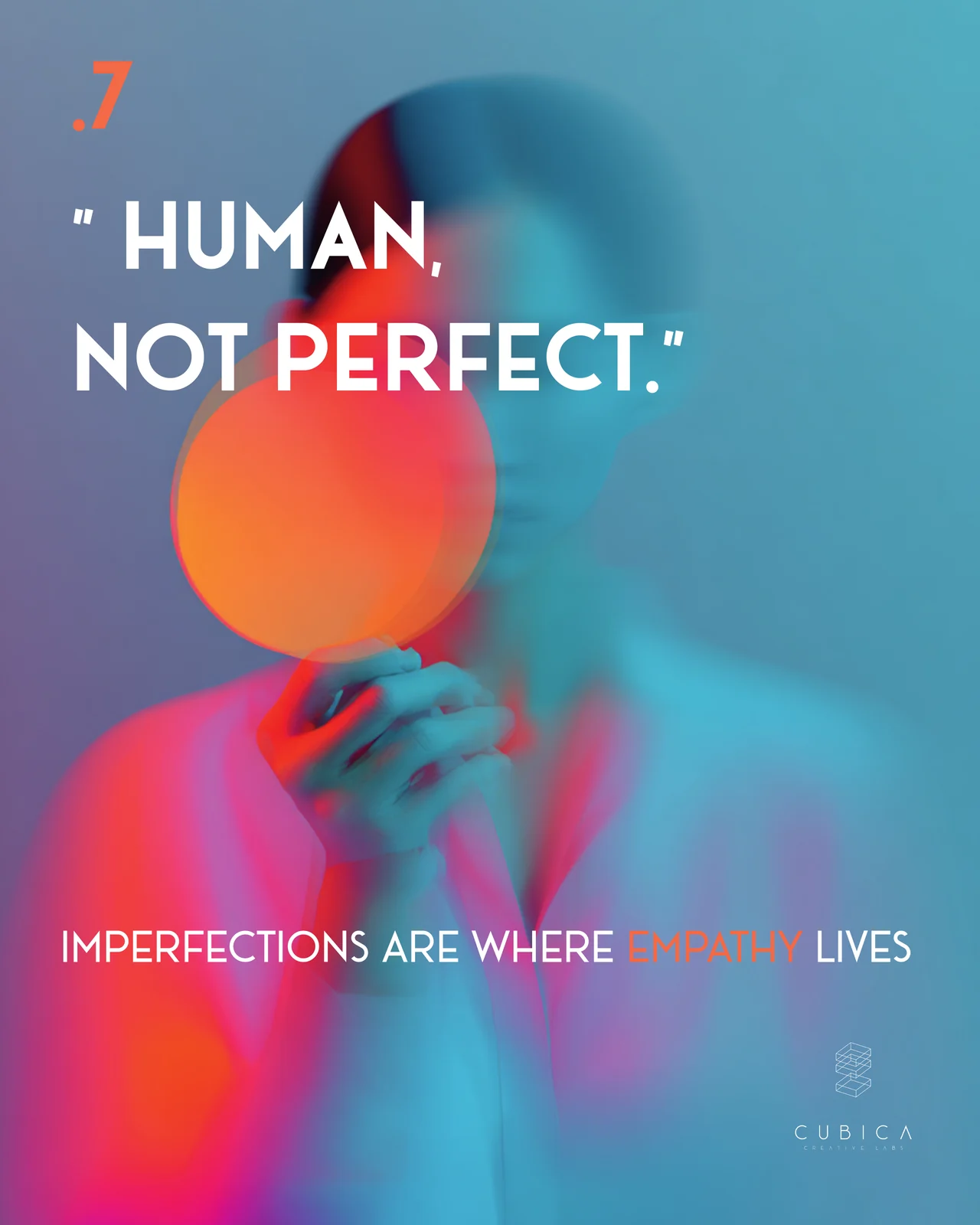
A short manifesto for digital experiences. A good one should leave you curious, not confused. Connected, not observed. Present, not passive. Awed, not overloaded. Seen, not tracked. Moved, not manipulated. And human, not perfect.
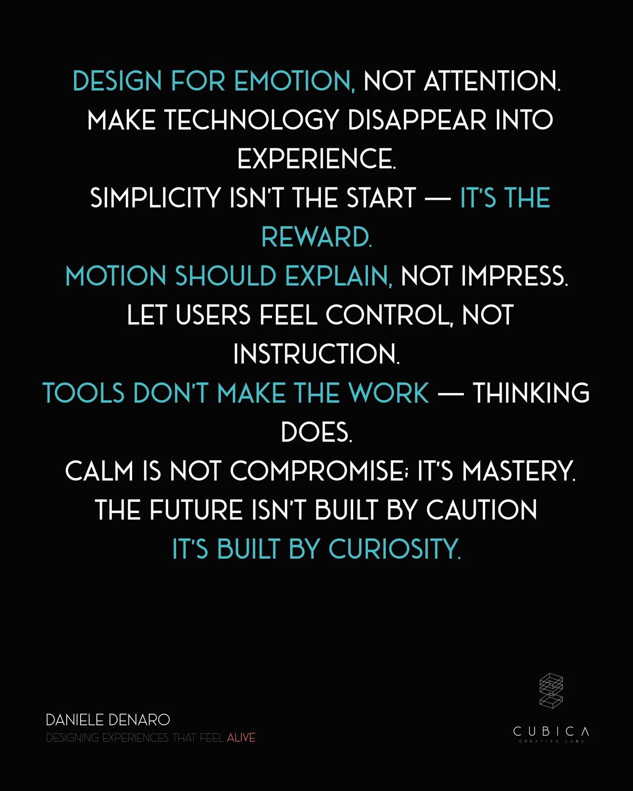
The carousel ends with a few rules: design for emotion, not attention. Make the technology disappear into the experience. Motion should explain, not impress. Let users feel in control instead of being instructed. Tools don’t make the work, thinking does.
👉 Swipe through the slides below for the seven feelings and what each one means.
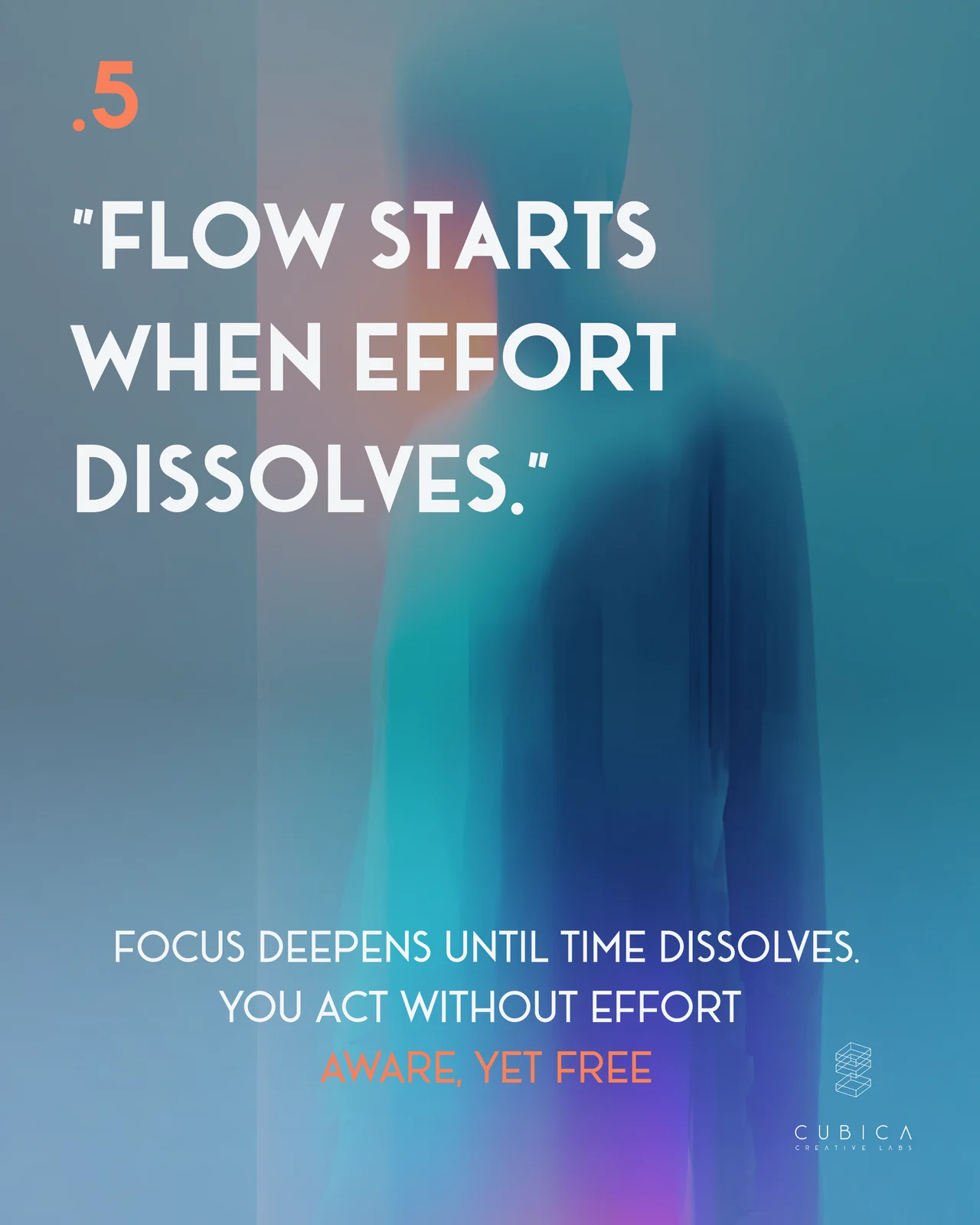
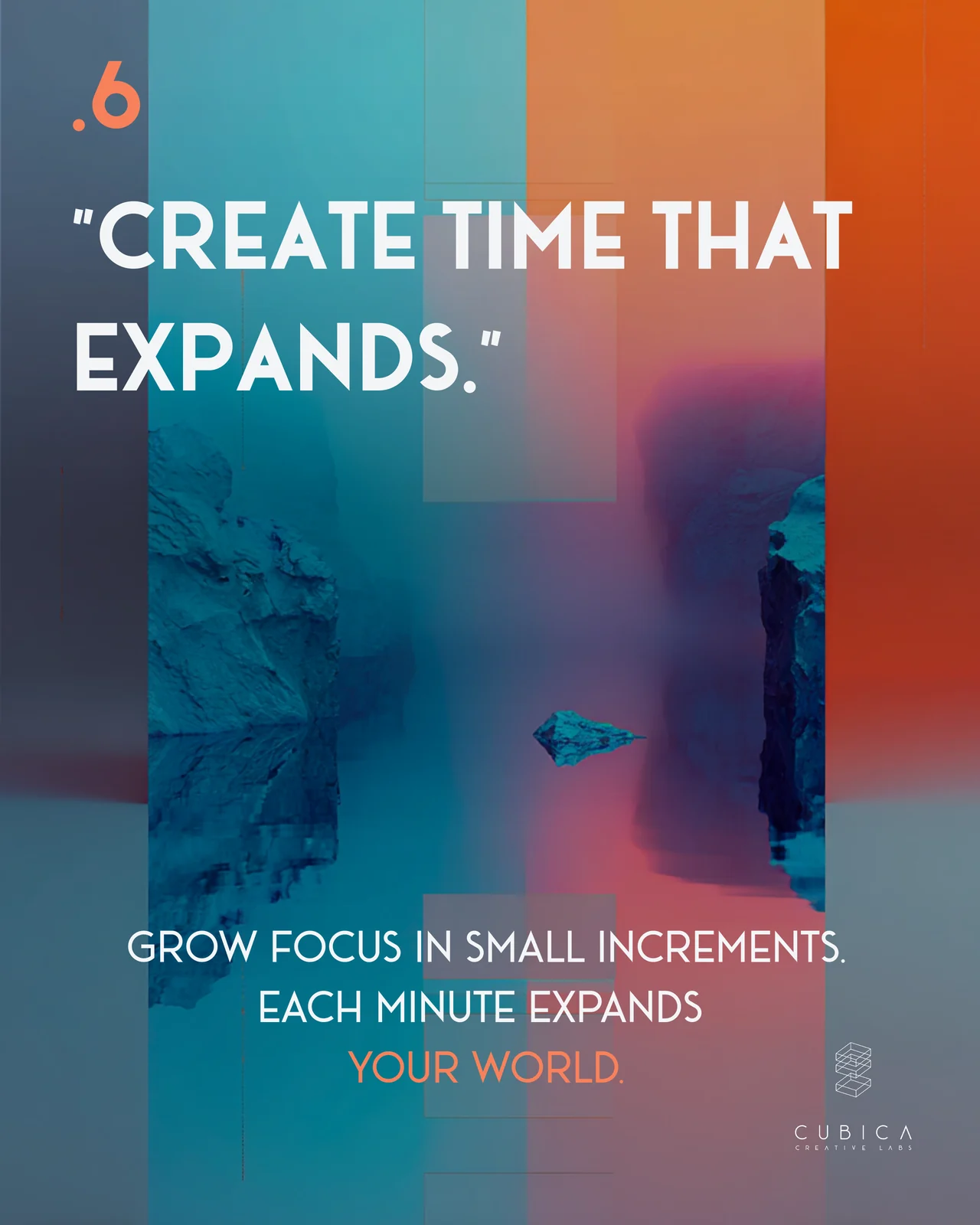
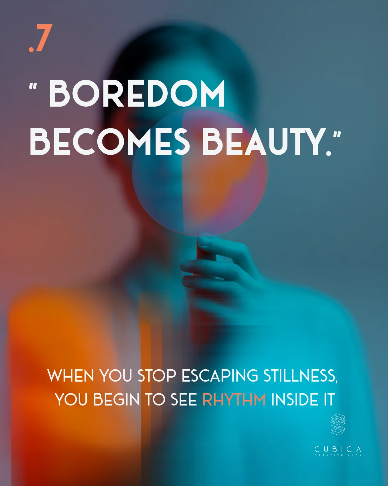
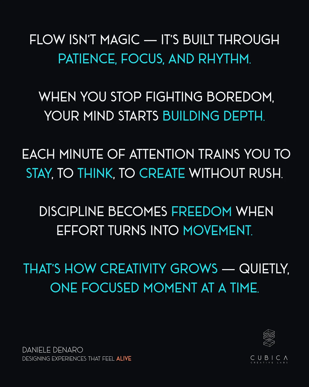
The discipline of flow.
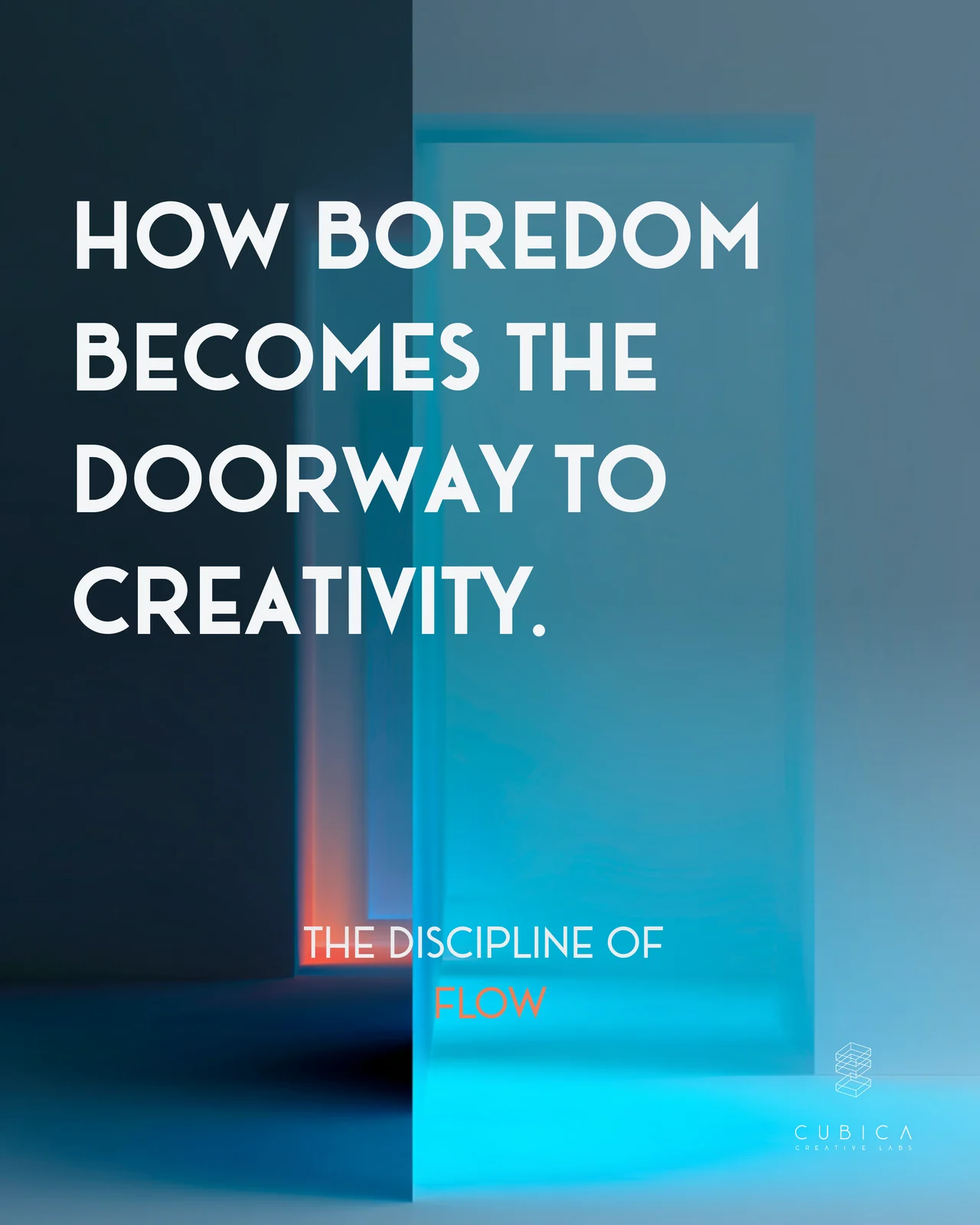
Boredom is usually treated as something to escape. In this carousel it’s the starting point for creative work: the quiet moment before ideas begin to form.
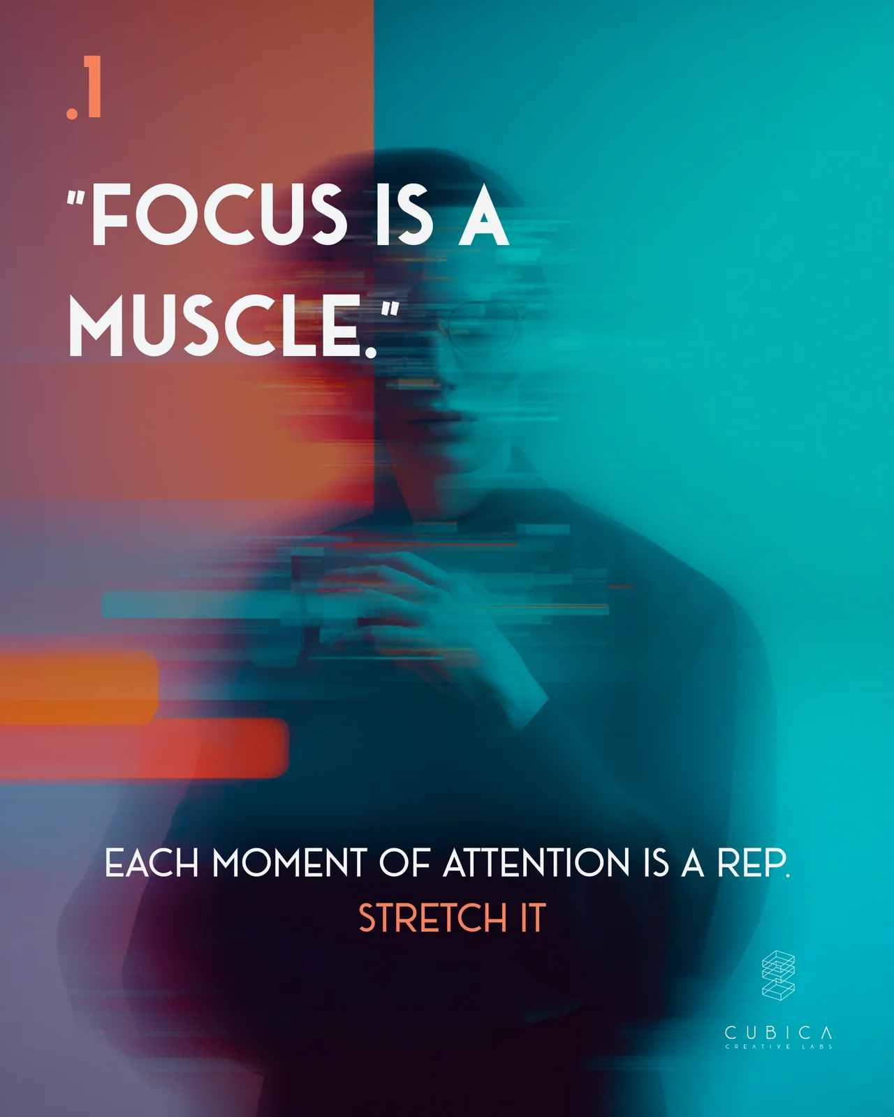
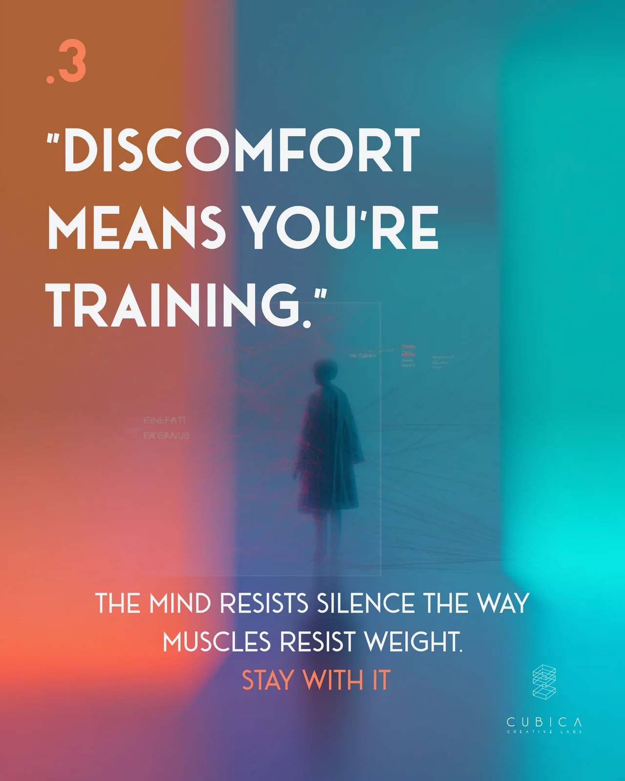
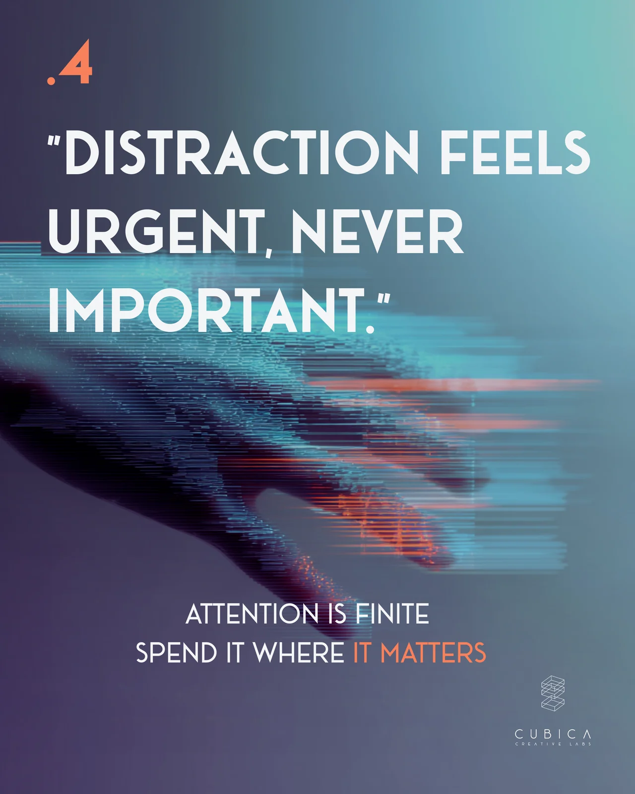
Focus works like a muscle. Each moment of attention is a repetition, and the discomfort of staying with one task means you’re training it. Distraction always feels urgent, but it’s rarely important. Attention is limited, so it’s worth spending where it matters.
Flow isn’t magic. It’s built through patience, focus and rhythm, growing your attention in small steps until you can work without forcing it.
👉 Swipe through the slides below to see how boredom becomes a doorway to creativity.
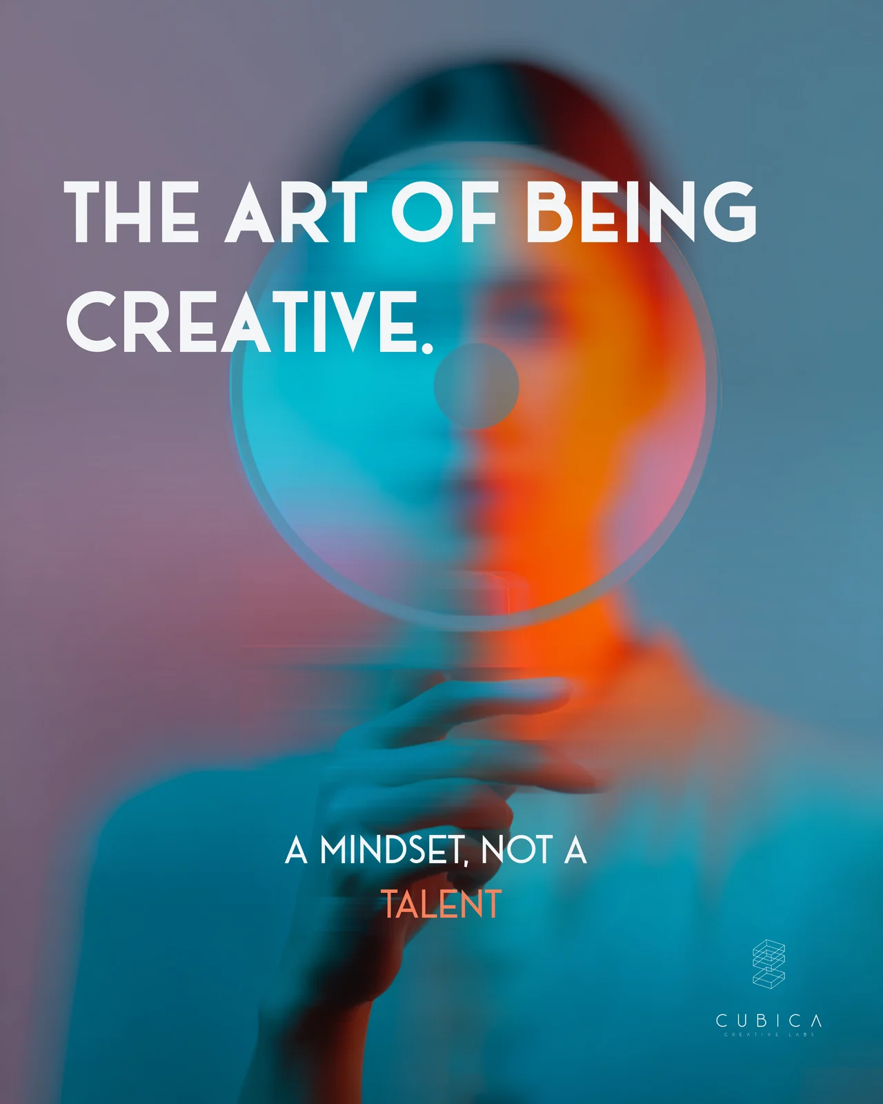
The art of being creative.
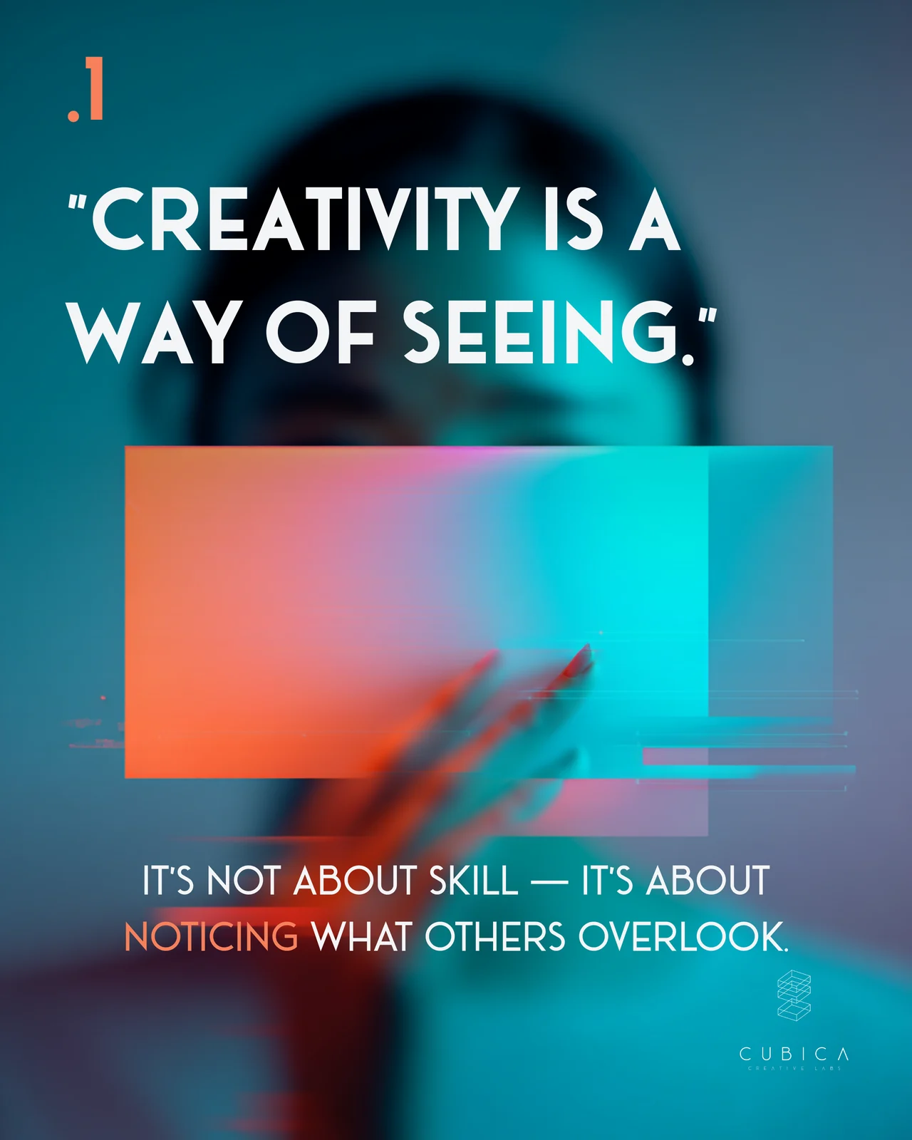
Creativity is a mindset, not a talent. It’s less about skill and more about noticing what others overlook.
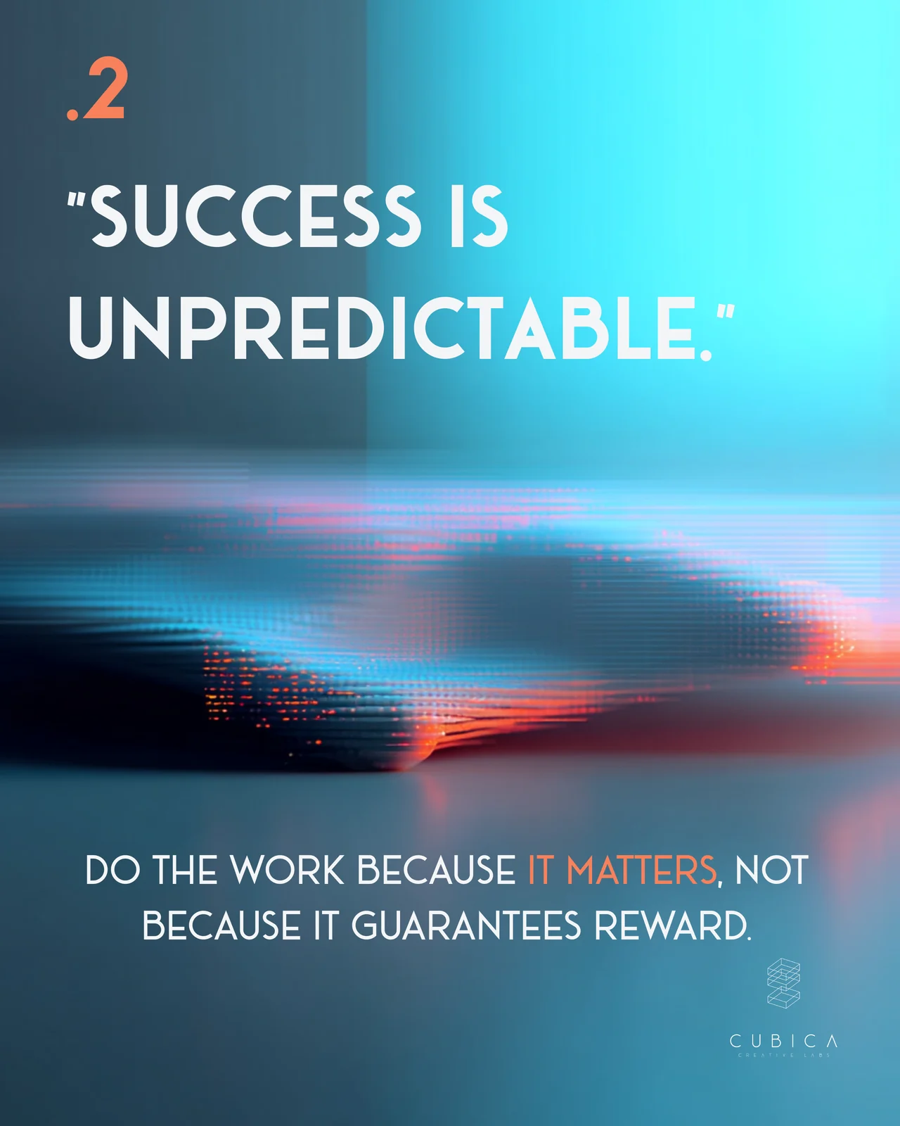
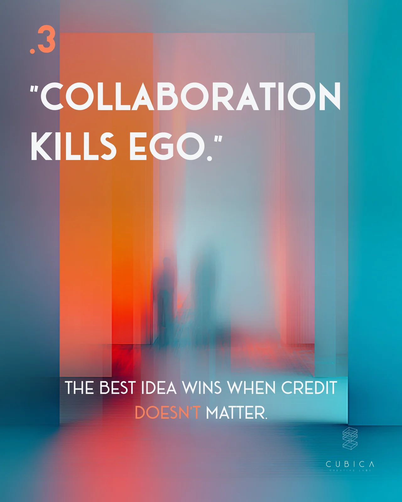
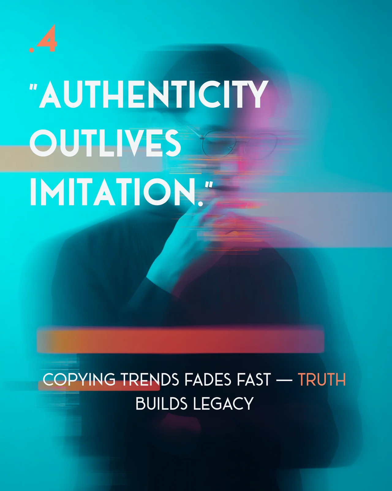
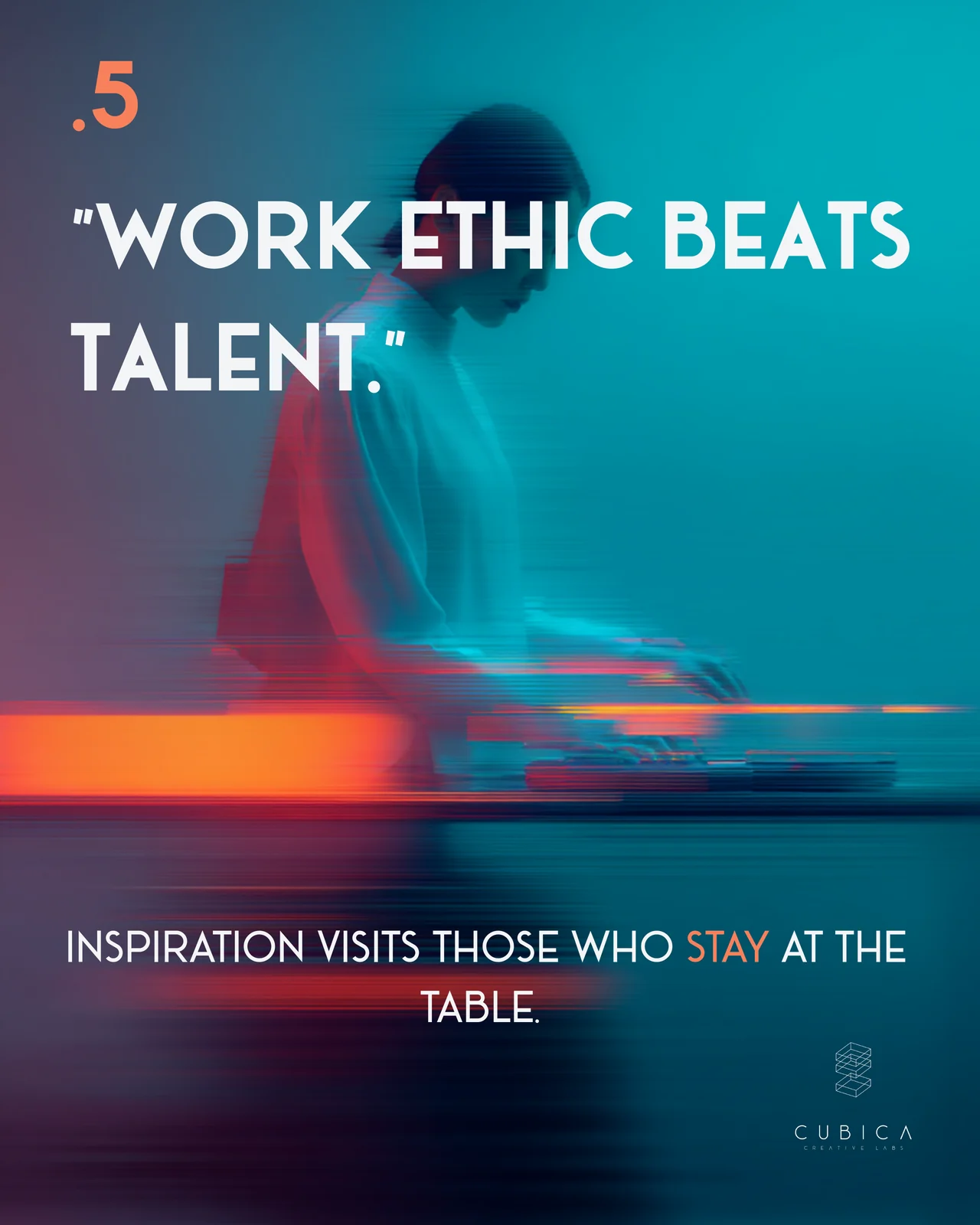
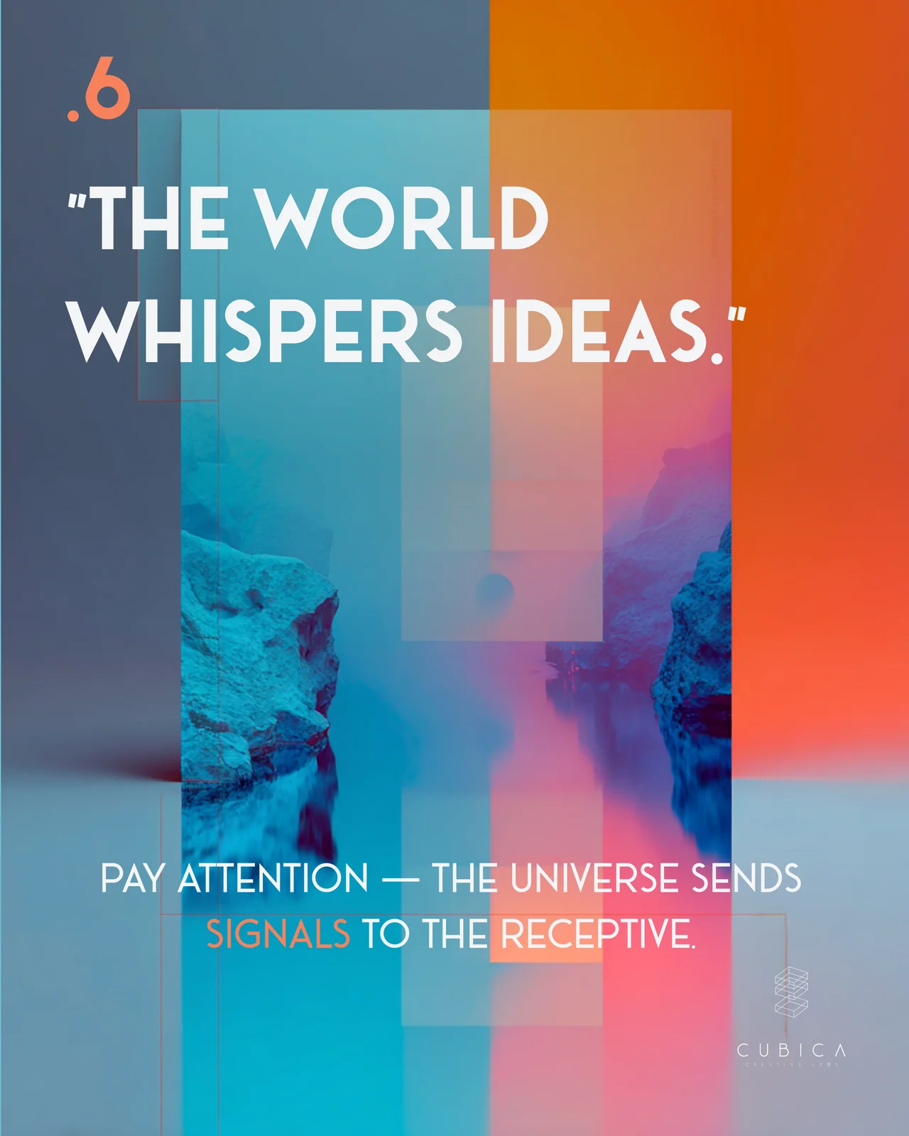
The carousel collects six ideas about creative work: do the work because it matters, not because it guarantees a reward. Let the best idea win, even when the credit goes to someone else. Stay authentic, because copying trends fades fast. Keep showing up, because steady work beats talent. And pay attention to the signals around you.
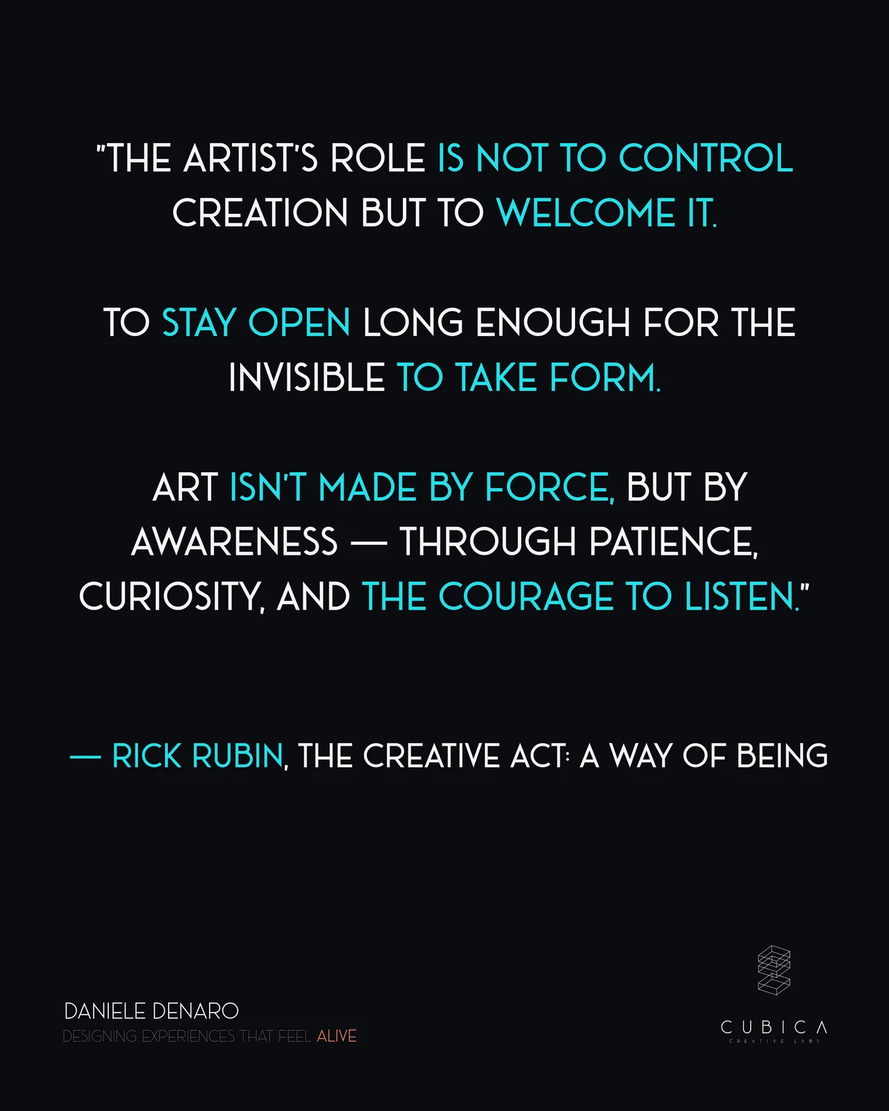
It closes with a quote from Rick Rubin’s The Creative Act: A Way of Being.
👉 Swipe through the slides below for the six ideas.
If you want to read more follow me on Linkedin
I write more regularly about these topics on LinkedIn. If you want to engage with these ideas or share your own thoughts on the future of our field, that is where I am most active.
Let’s connect on LinkedIn